Stampede – logo, manual and t-shirts for a parkour association in Gothenburg
Two parts, three colour versions and a manual that shows how to use them. That's how a parkour association in Gothenburg got a mark that holds together, from the t-shirt to the website.
Summary
Stampede is a Gothenburg-based parkour and freerunning organisation. It was founded in 2010 and became an official sports association in 2012. It teaches parkour and freerunning and also takes on stunt work. In 2015 we created the association's logo and visual identity: two logo parts in black, white and blue, a manual showing how to use them, t-shirt designs and examples of posters and signs. A year later the logo sat at the top of the association's website.
One manual that holds it all
The heart of the work is an 18-page identity and logo manual, marked “INCRANE © 2015”. It covers the logo, the colours and the typography, and shows examples of how it can all be used.
The manual says why it exists: to reflect the image, values and aspirations behind the brand, and to be followed carefully so that everything the association makes has the same style and quality.
An association has many people making prints, posters and posts. A manual means they don't have to guess.
Two parts that belong together
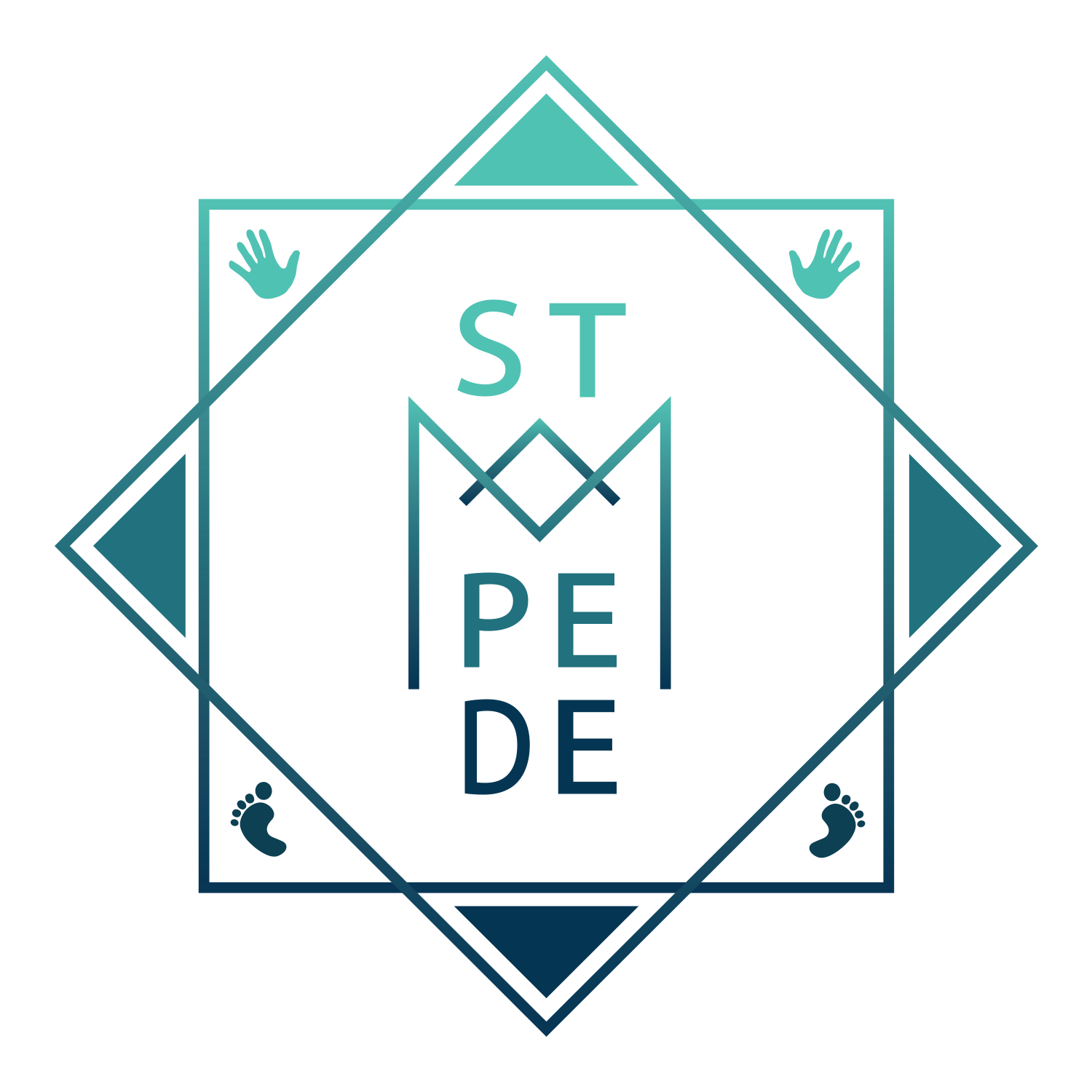
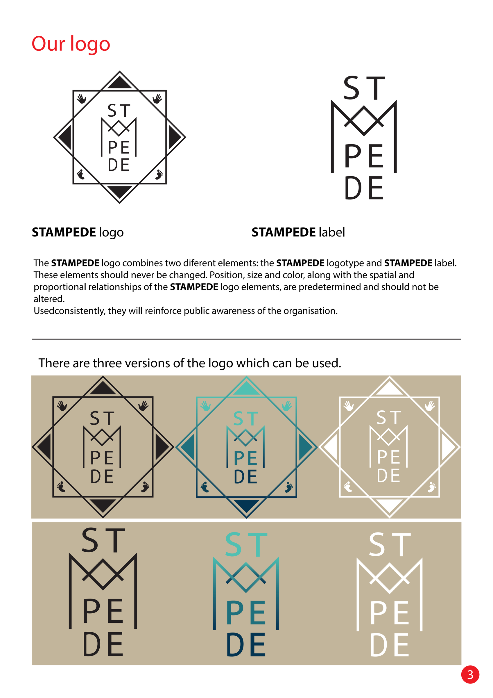
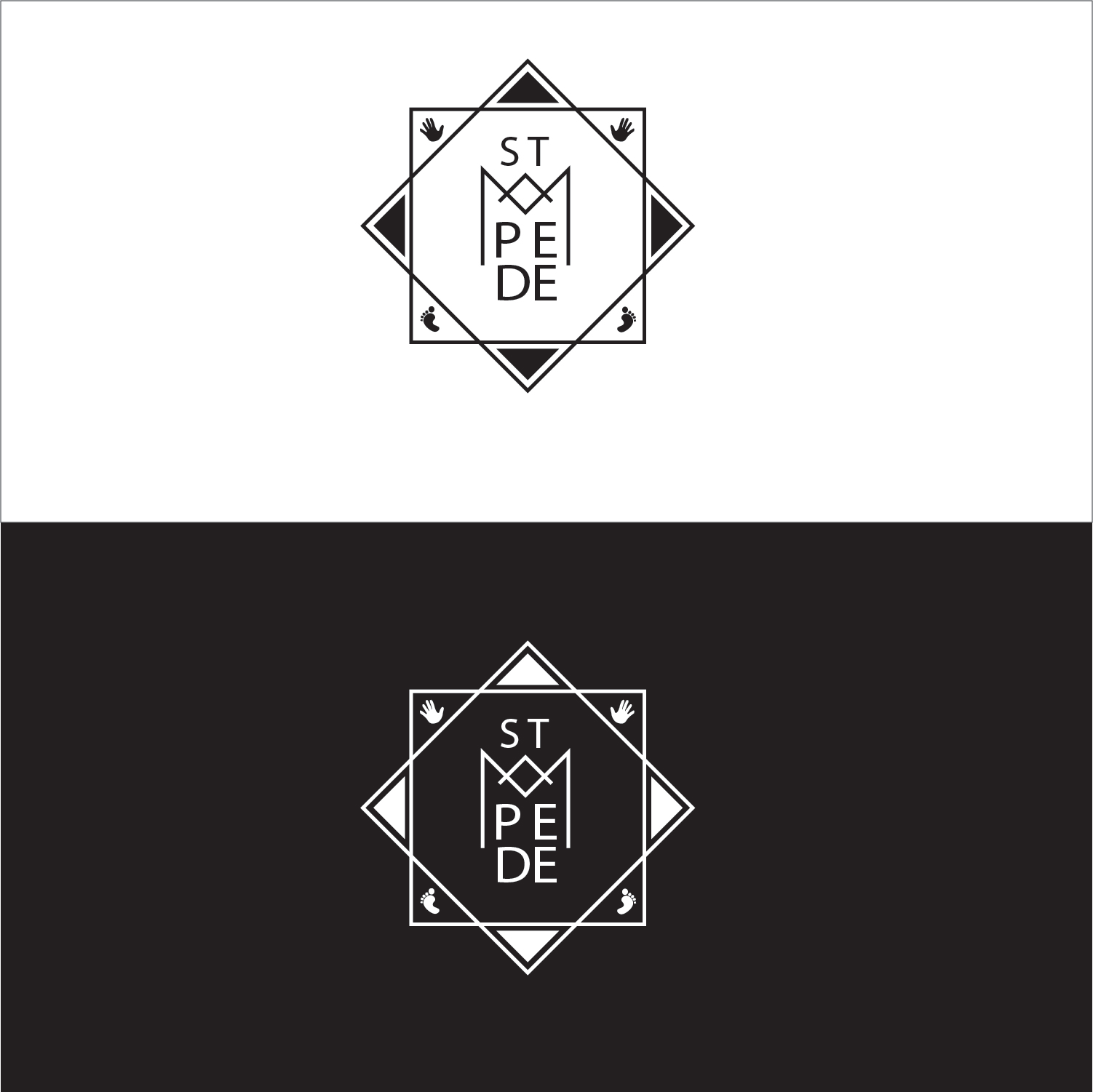
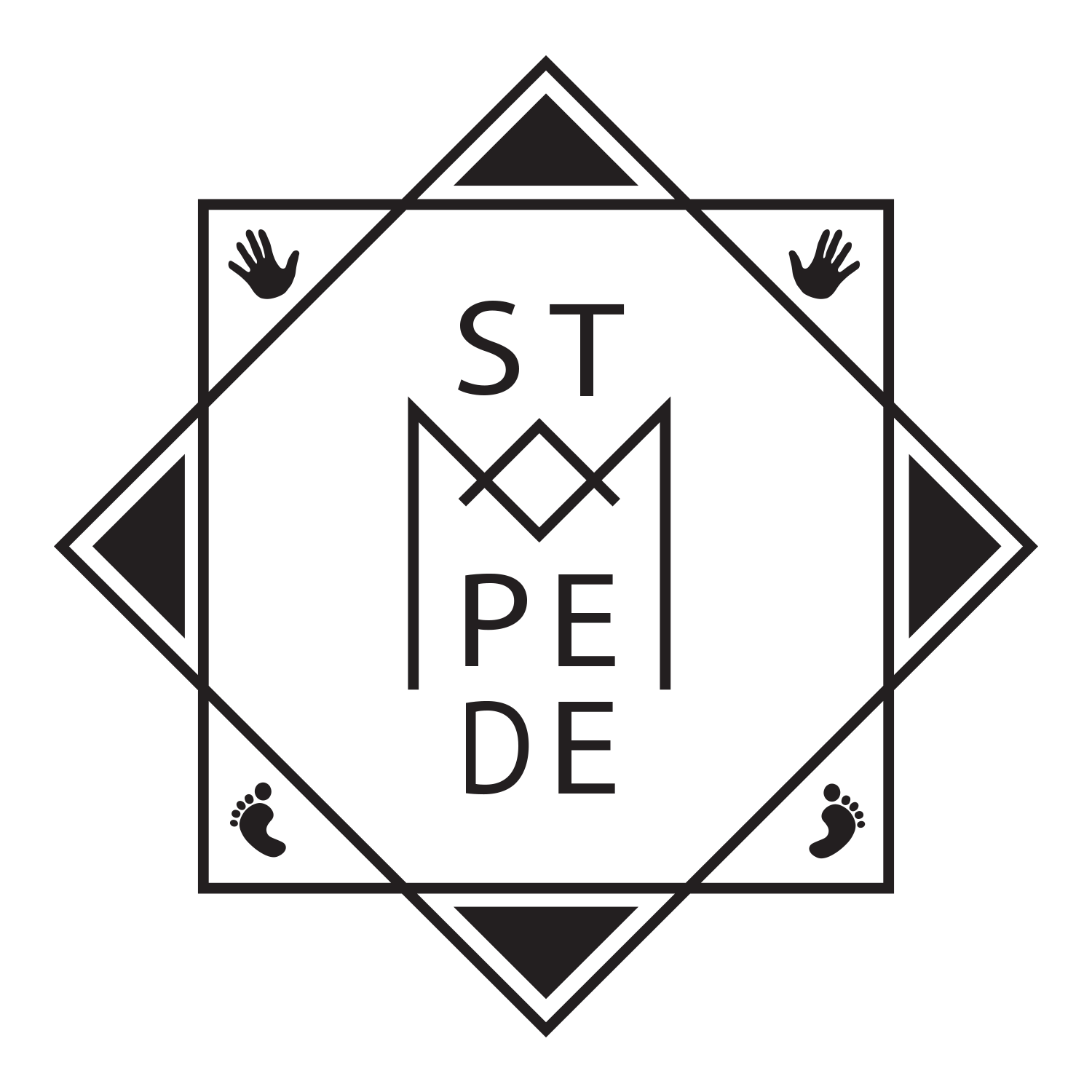
The logo is made of two elements: the logo itself and a stand-alone lettering the manual calls the “label”. In the logo, the letters ST, M, PE and DE are stacked inside a square and a diamond, with hands and feet in the corners. The label is the same letters on their own, with an M shaped like a crown. The manual says the parts should never be changed.

Three colour versions
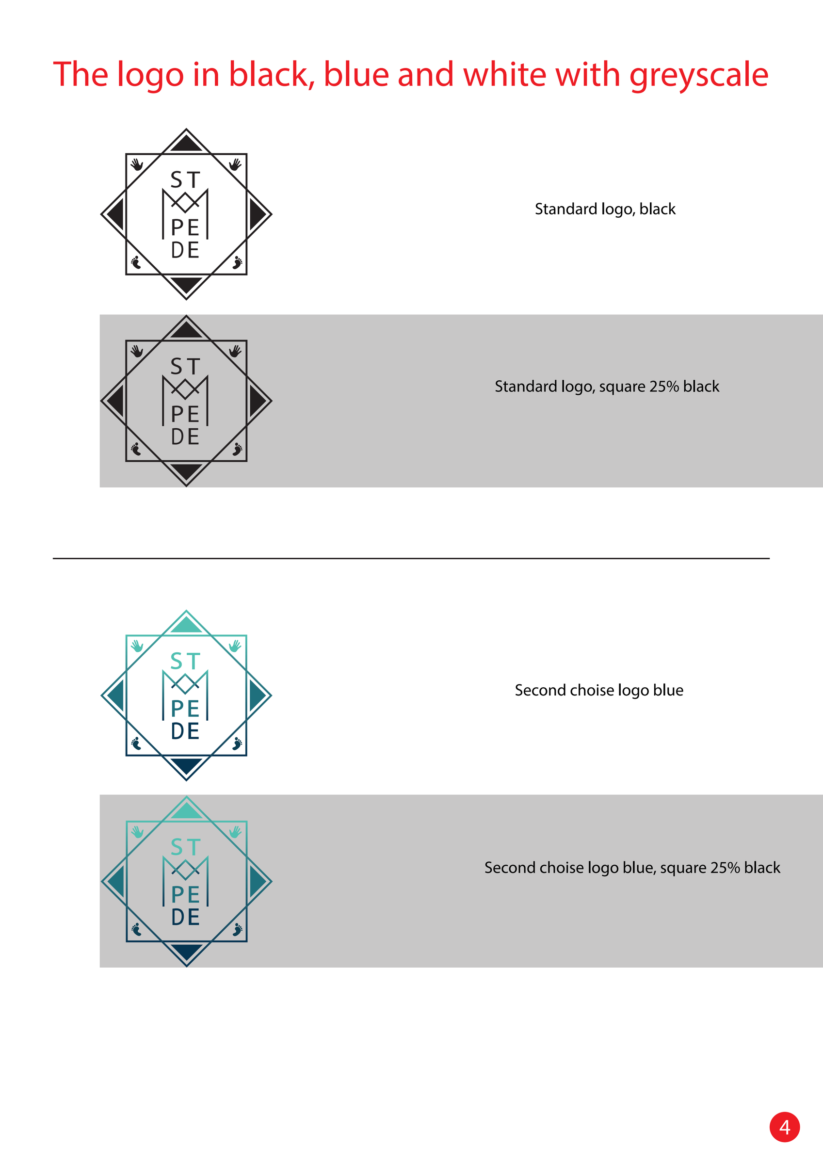
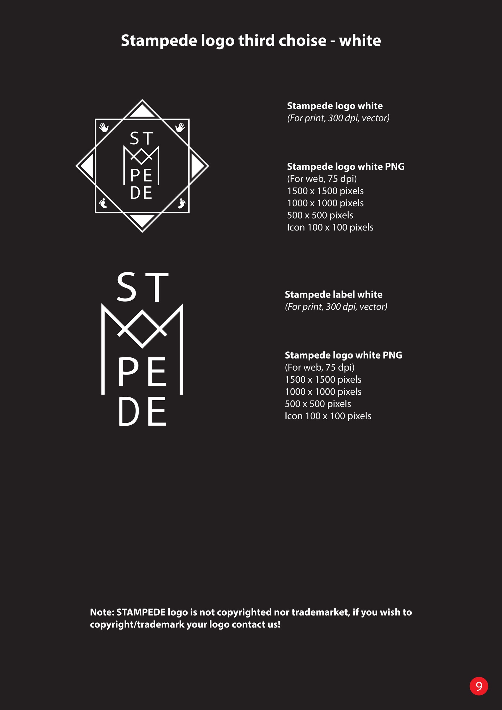
The logo comes in black, blue and white. The manual shows all three, and how they look on white, grey and black backgrounds. Each version was delivered in several sizes for the web, as small icons and as vector files for print.
Clear space
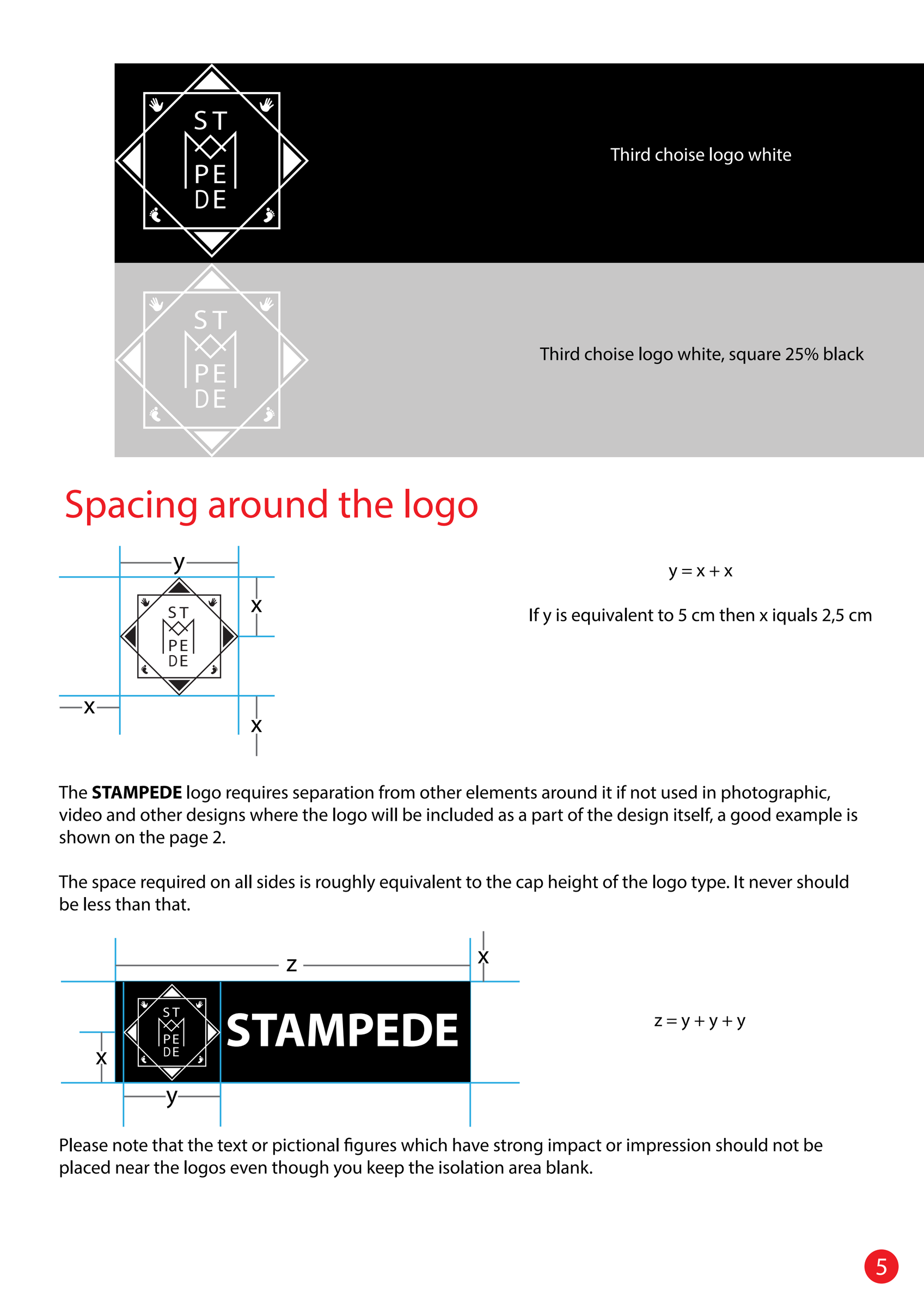
A logo needs room to be seen. The manual shows how much free space should surround the logo, so that text and images don't come too close.
It's a small rule that makes a big difference when someone else makes a poster or a banner.
Colour and type
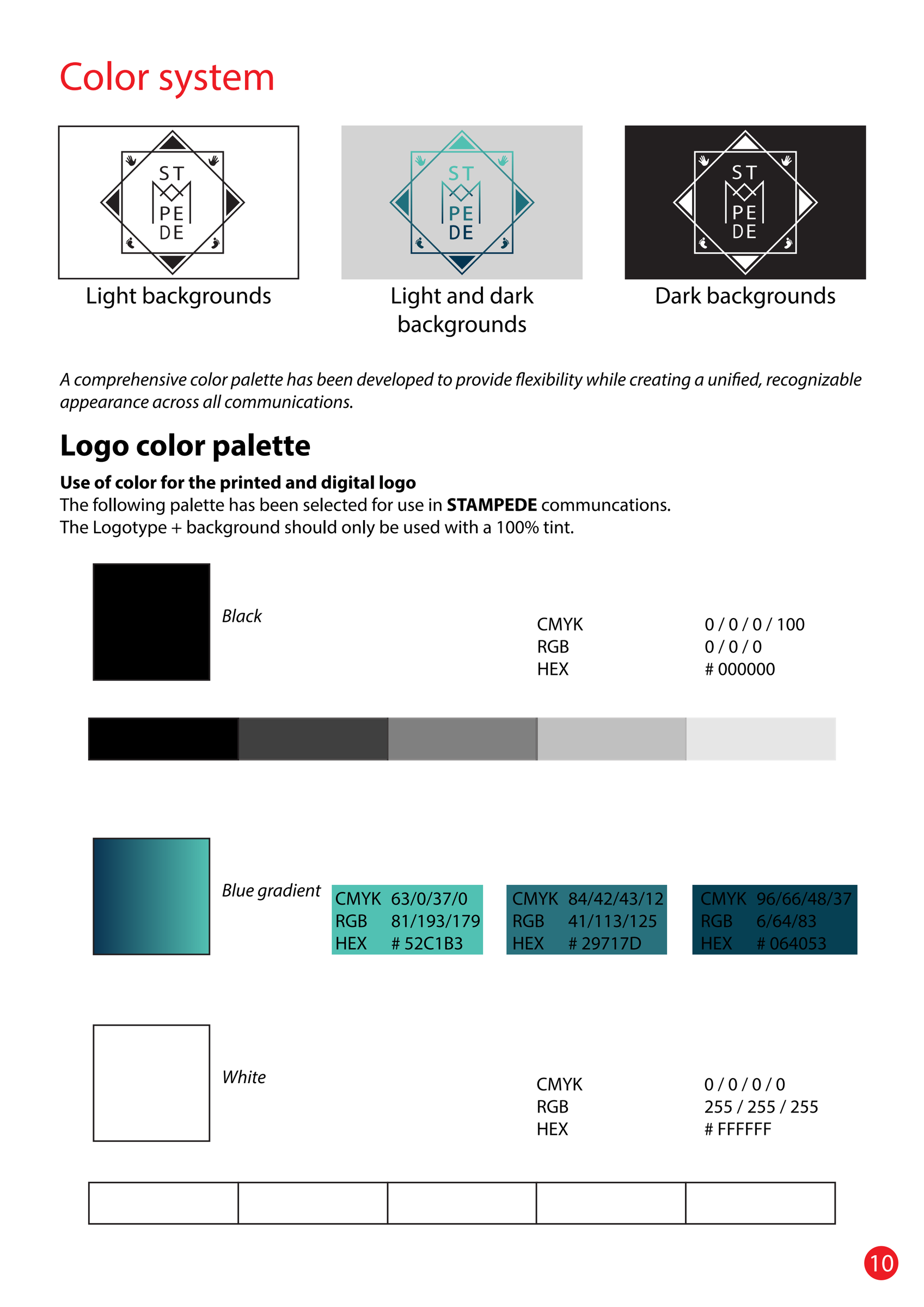
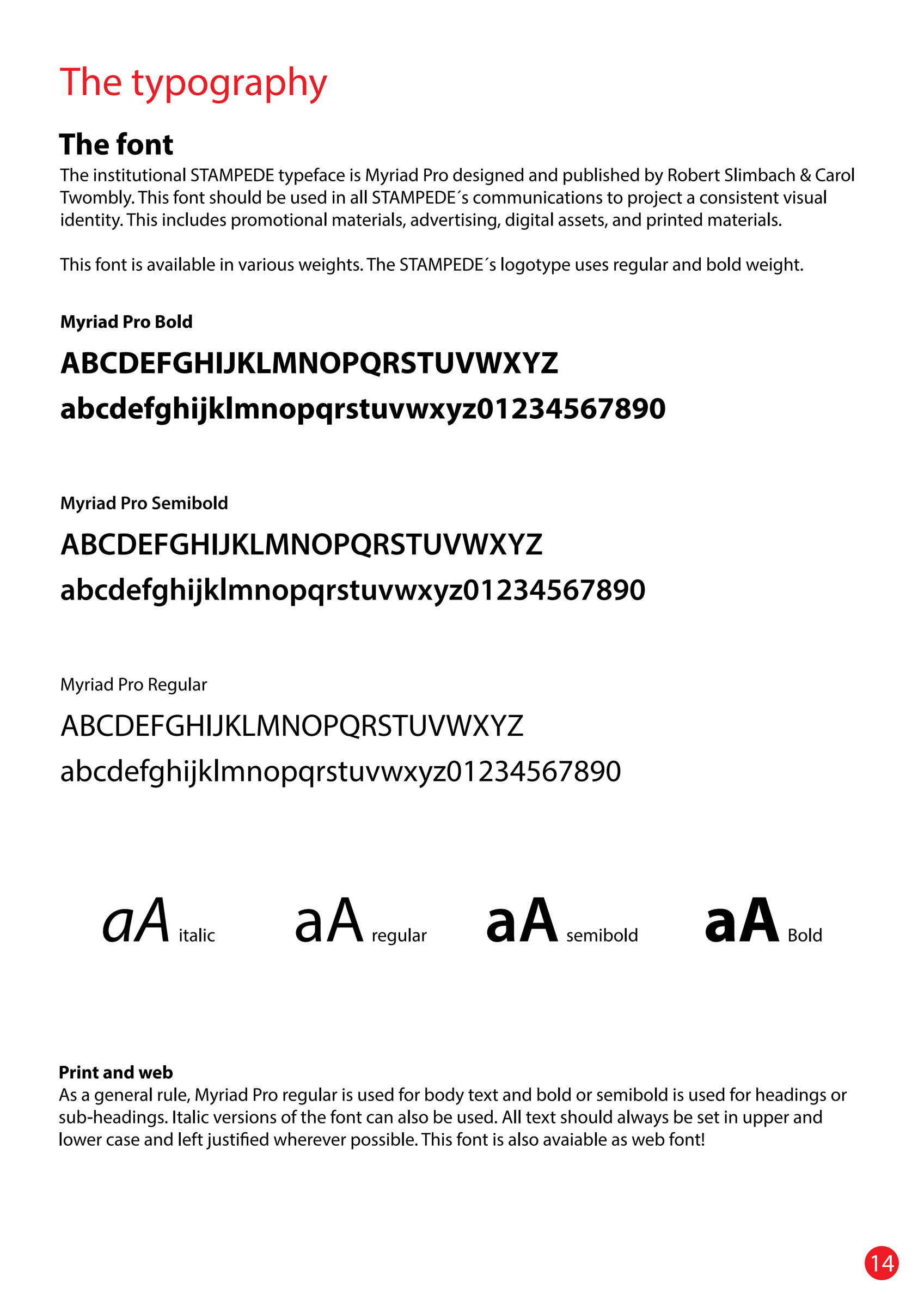
There are few colours: black, white and a blue gradient from turquoise to dark blue. The typography page shows which typeface to use and how headings and body text should be set.
Posters
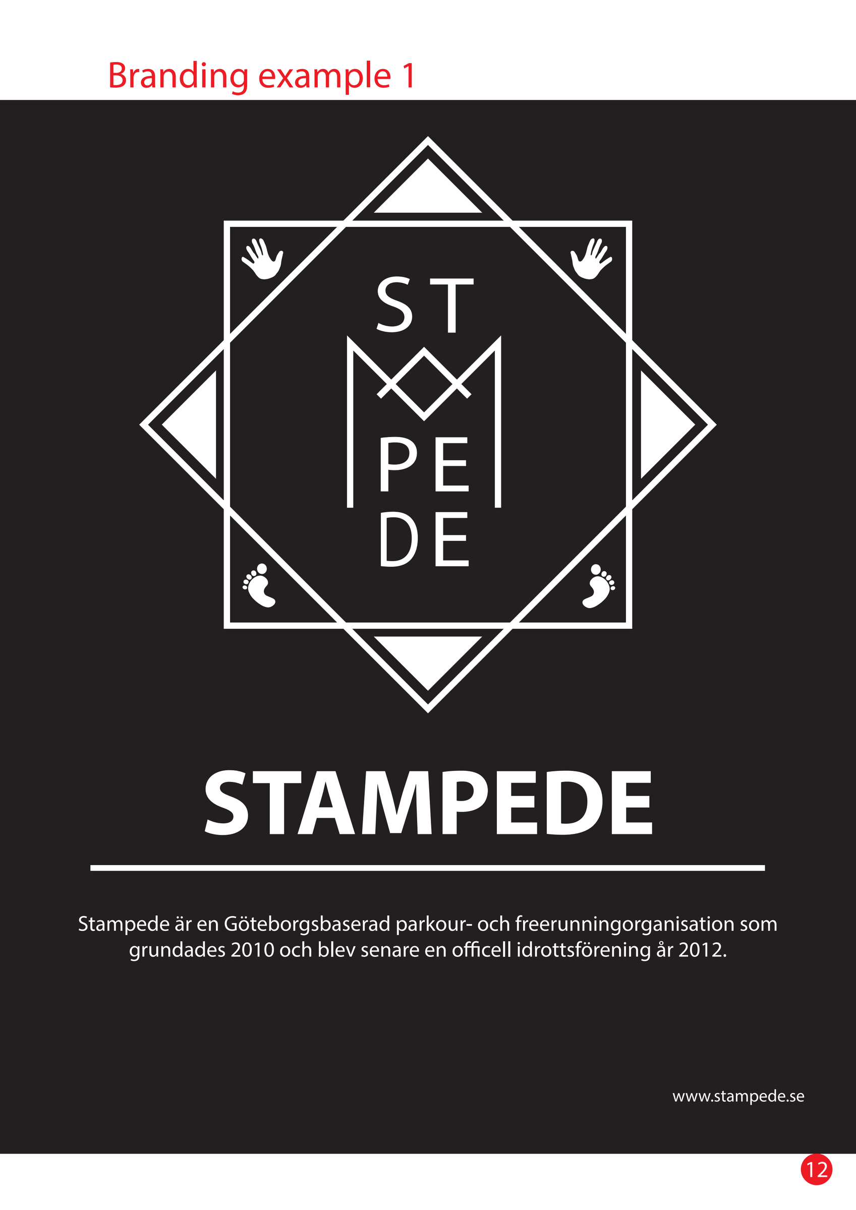
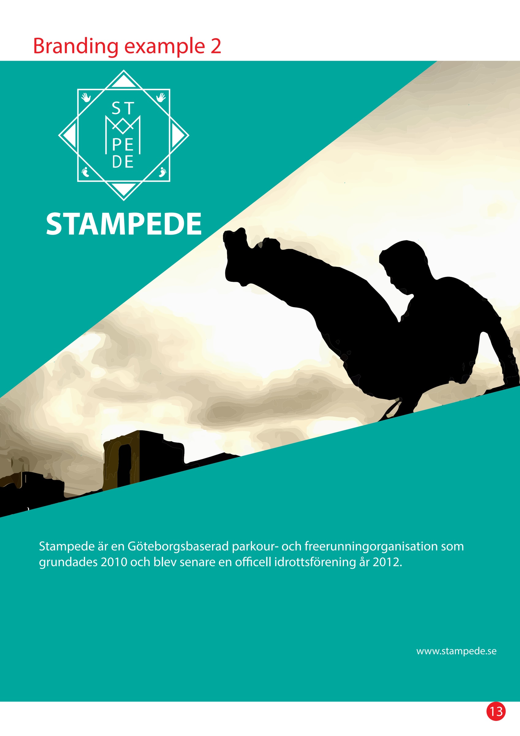
The manual also shows two example posters, where the logo sits with the association's name and a short text about who they are.
T-shirts
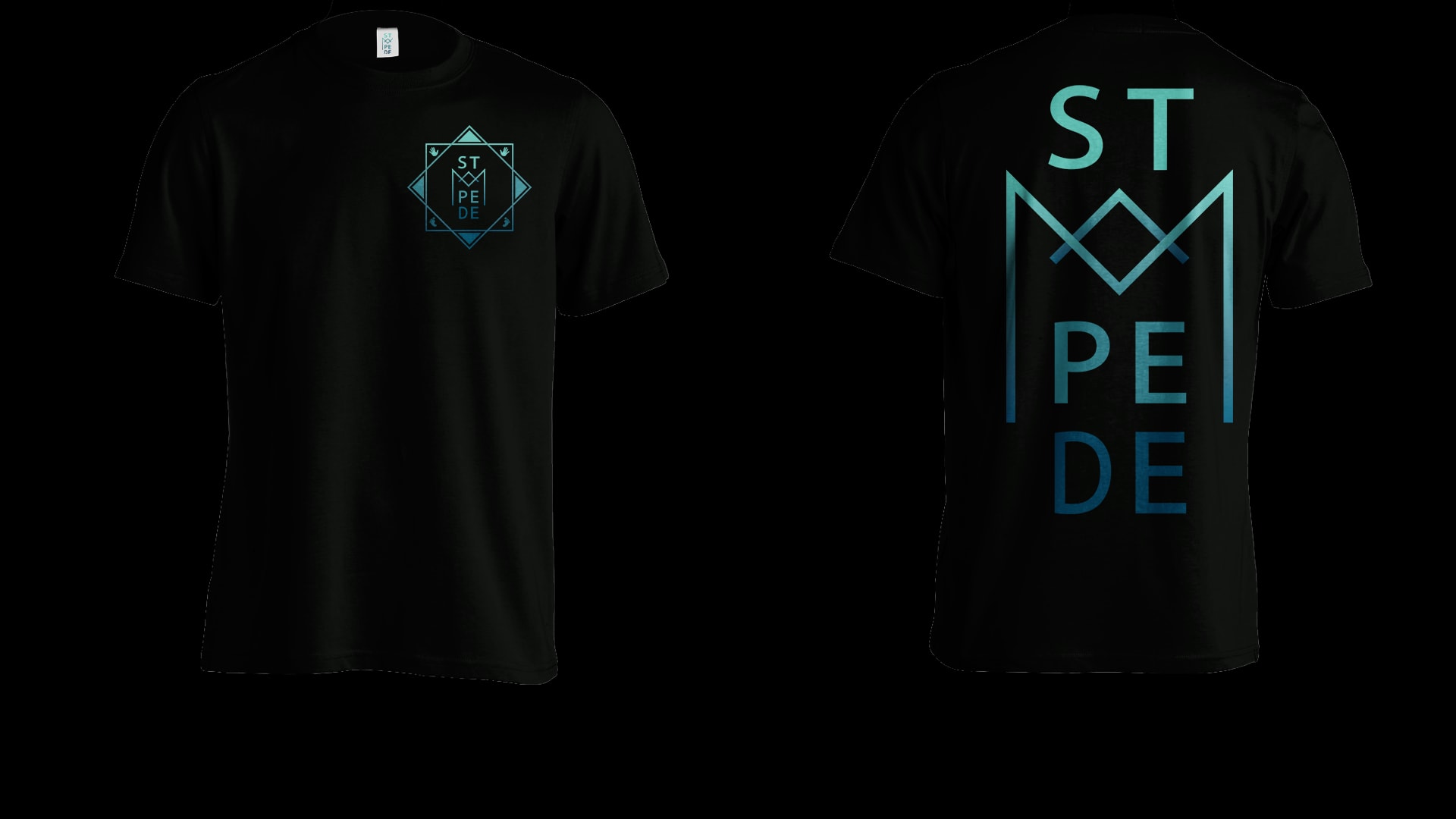
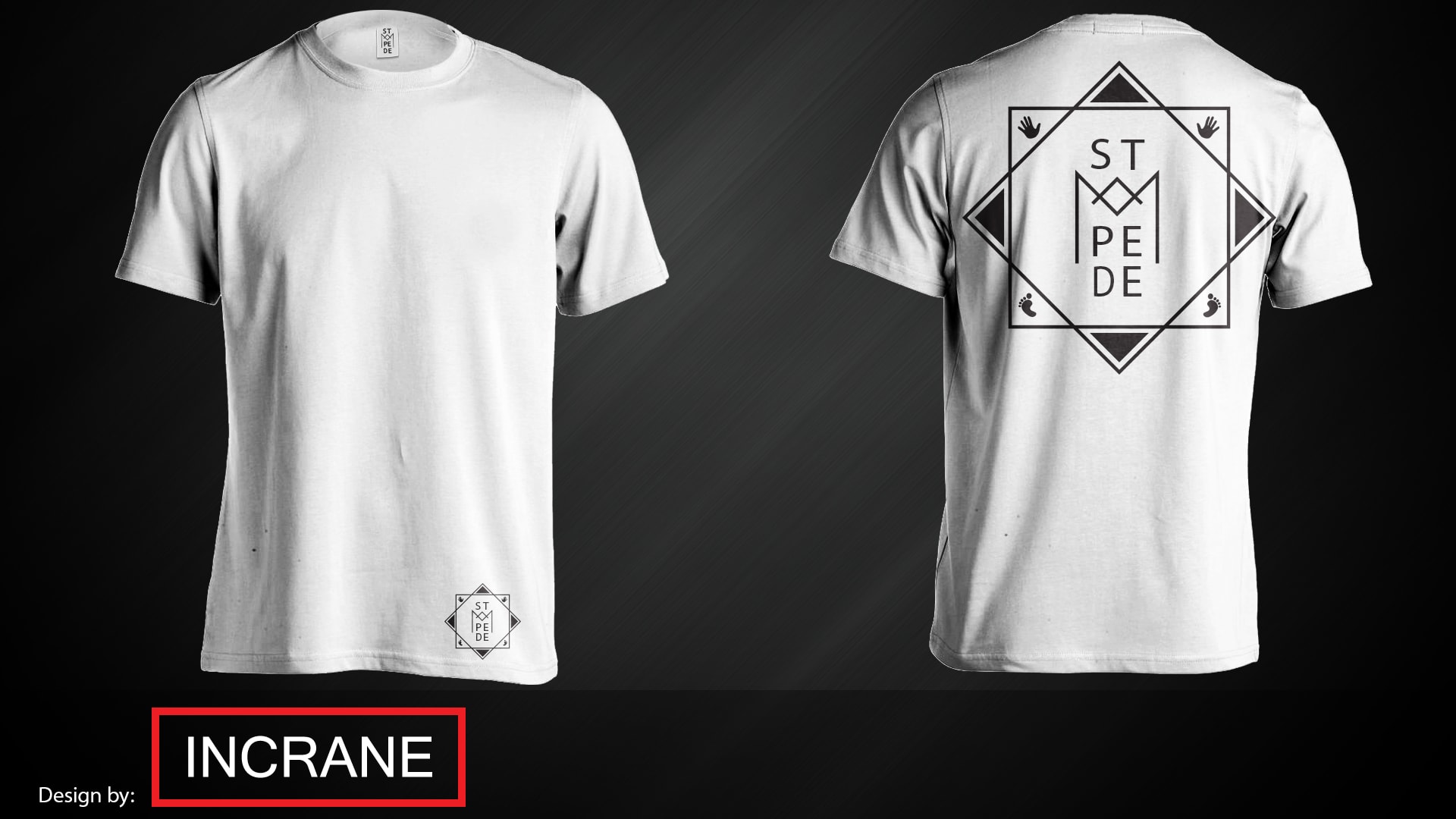
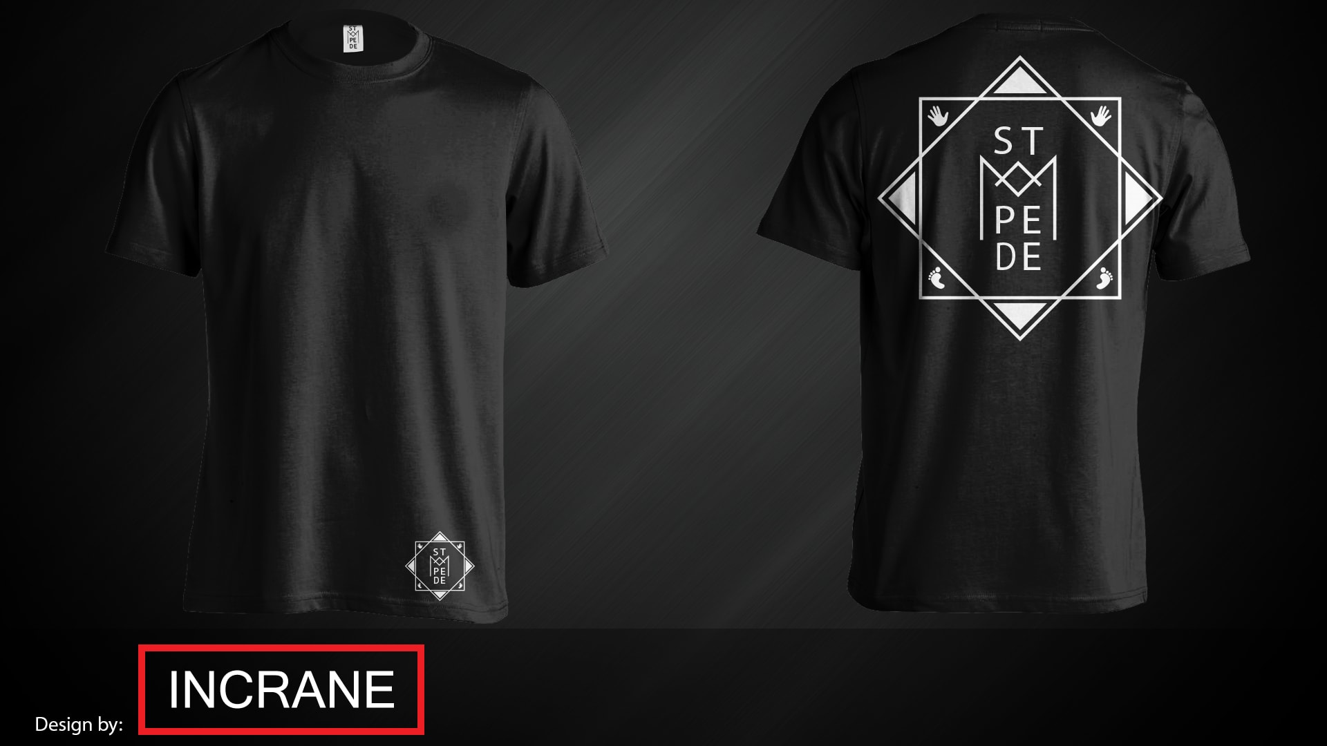
We made t-shirt designs in white and black, with a small logo on the front and a large one on the back. A year later came more designs, including one with the lettering in blue down the whole back.
Examples of use
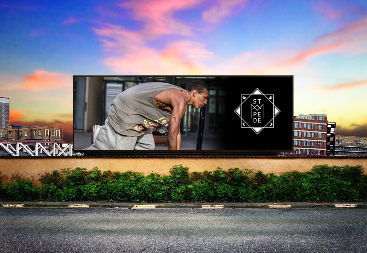
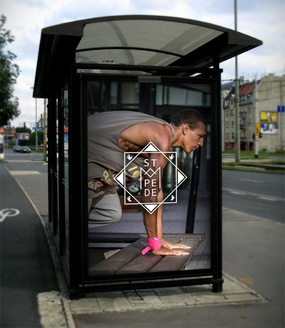
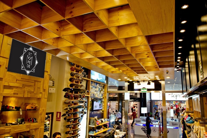
To show how the identity works at a large size, we placed it in settings like a billboard, a bus shelter and a shop. These are example images, not campaigns that were run.
From sketch to final version
The first sketch was made on 13 November 2015. Four more versions followed the same day, differing only in details. The basic shape is already visible in the first sketch.
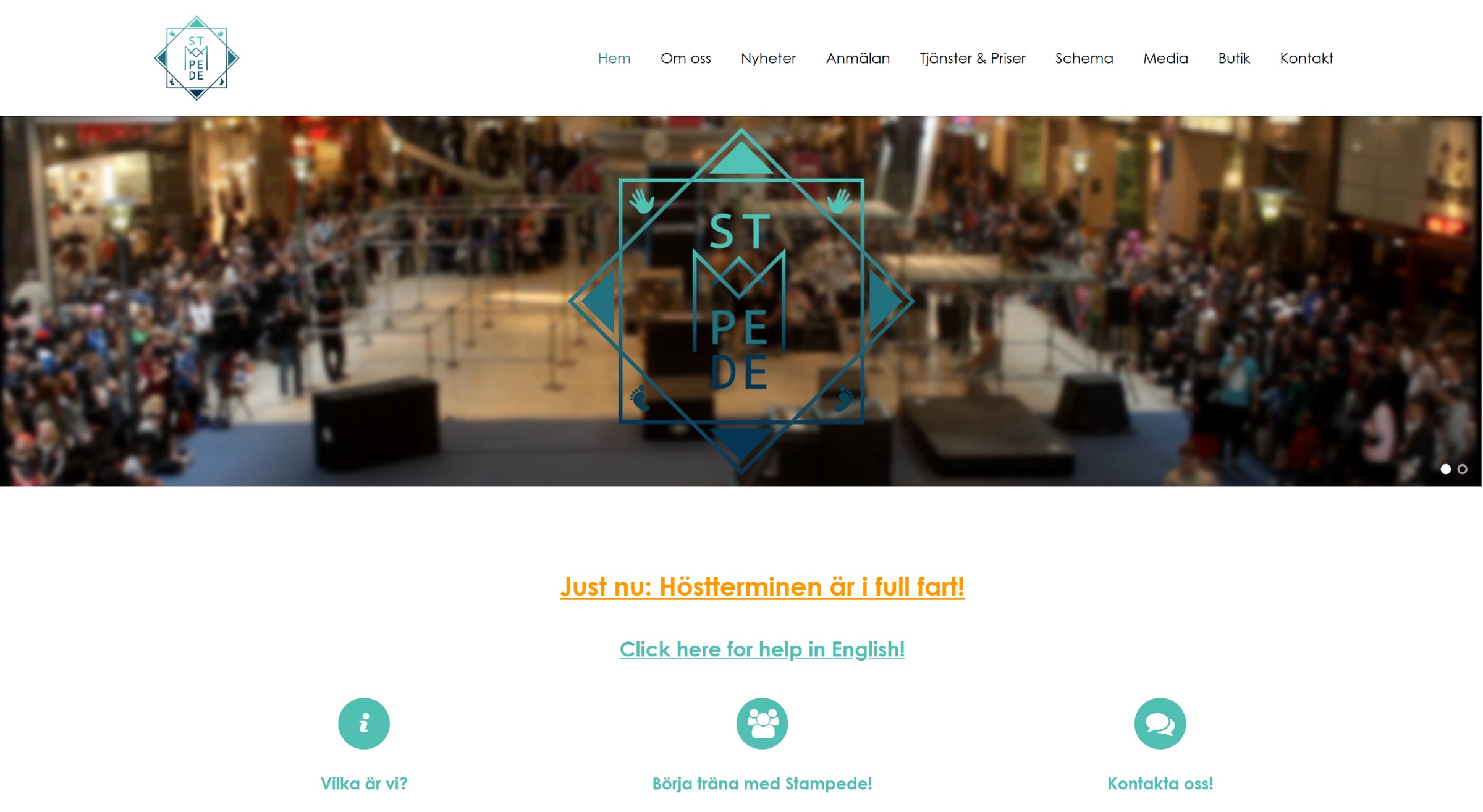
The logo in use, 2016
A year after delivery, the logo sat in the menu of the association's website, and large in blue over a photo from a show in a shopping centre.
The image is an archive copy from autumn 2016. The association has since changed to a different logo.
What we delivered
- Logo and stand-alone lettering (the “label”) in black, white and blue
- Web files in three sizes, small icons and vector files for print
- Identity and logo manual covering the logo, colour versions, clear space, colours and typography
- T-shirt designs in white and black
- Example images with posters, a billboard, a bus shelter and a shop sign
More projects
Got a similar project?
Tell us what you want to achieve and we'll come back with how we'd approach it.
Book a free consultation