Seagera — a visual identity for a security company that has to be seen before anything happens
For a security company the brand is part of the protection — the sign on the gate should do the work before the camera has to record anything.
Summary
Seagera is a Swedish security company, founded in 2019 according to the company, working with camera alarms, camera detectors, alarm monitoring and guard response. Between 2020 and 2022 we developed the company's visual identity — logo, tagline, typography and colour palette — along with warning signage for monitored sites and a consistent structure for the product copy.
The challenge
Seagera was a young company in a category where most suppliers offer much the same thing. The company put its own difference this way: where other security firms sell the same cameras, alarms and detectors year after year, Seagera reviews new technology every year and updates its range accordingly.
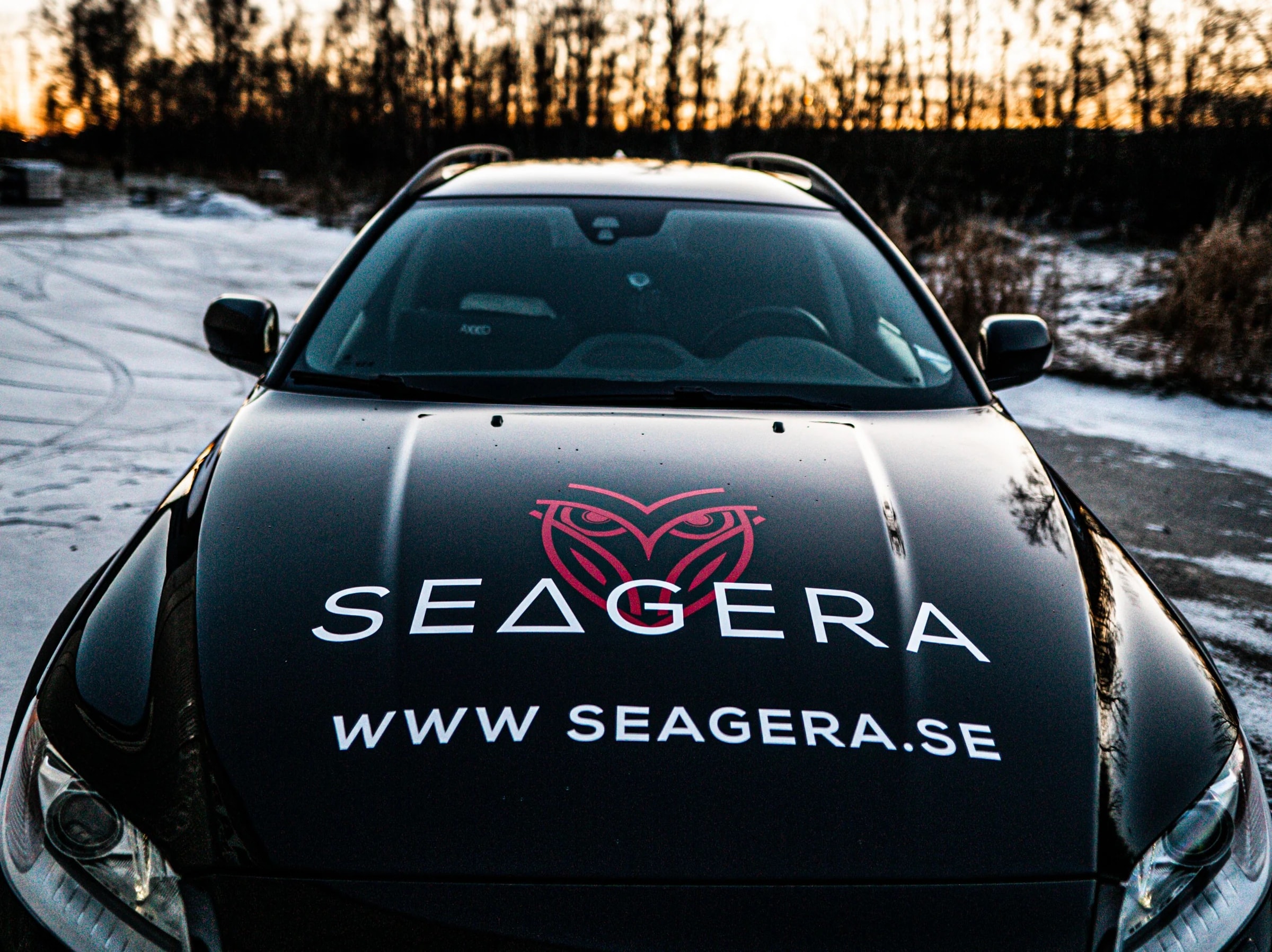
The job was to give that stance a form. A security brand is rarely encountered first in an advert — it is encountered on a sign at a gate, on the side of a service vehicle, on a label beside a door. The identity had to work in exactly those places: small, often in poor light, with about a second to land.
The client's own ambition was blunter. In the brand questionnaire they wrote: “If you see our signs and labels, you had better go somewhere else.”
The owl
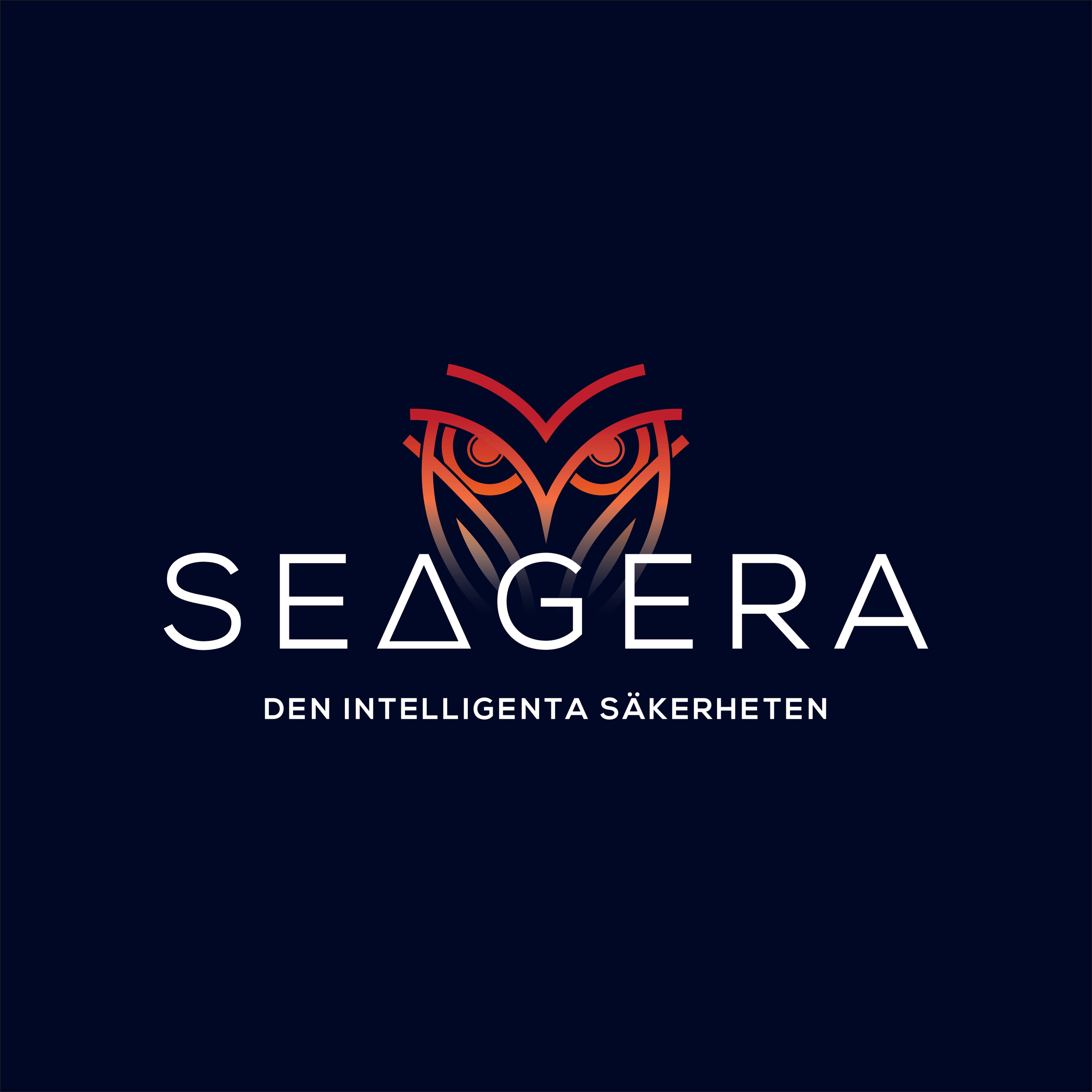
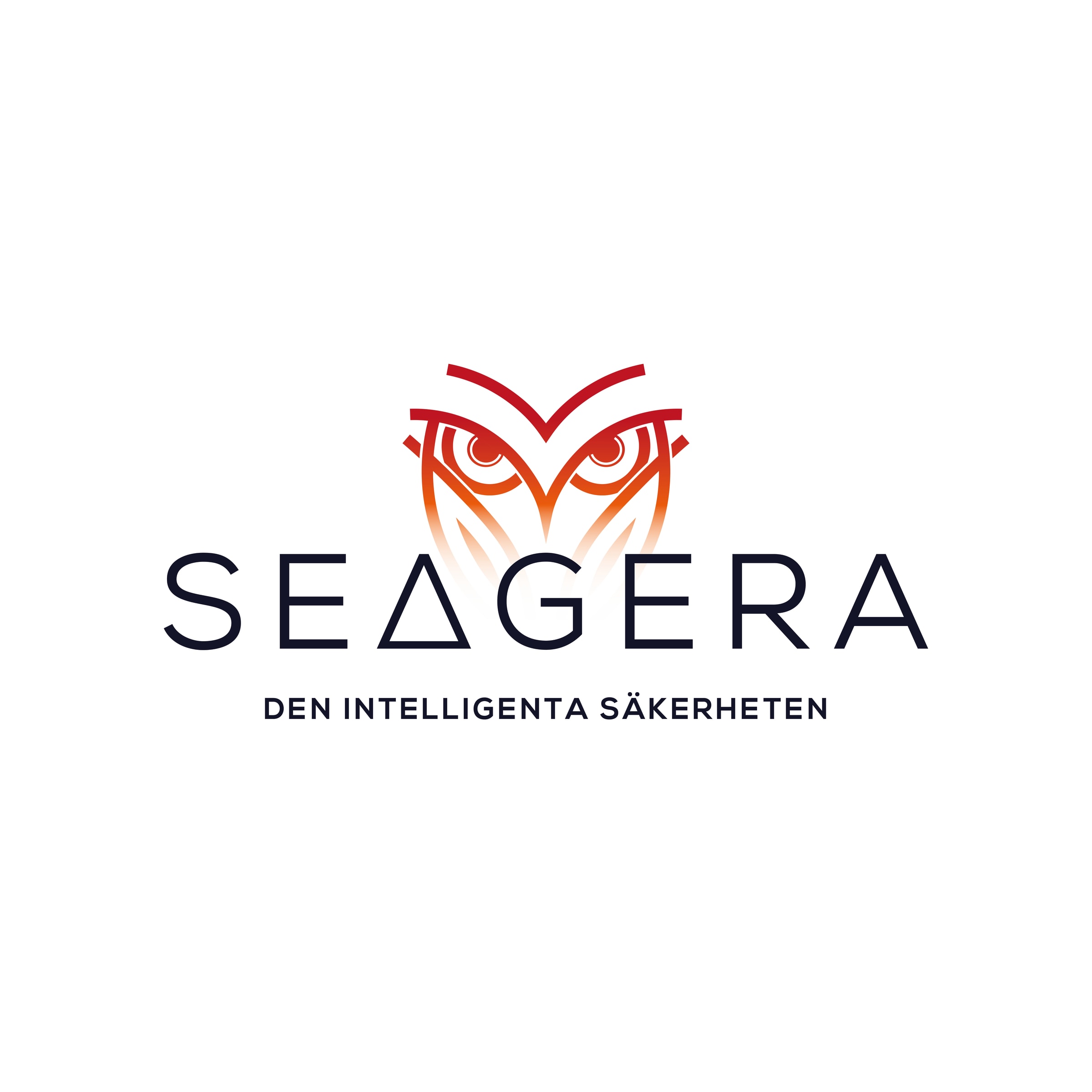
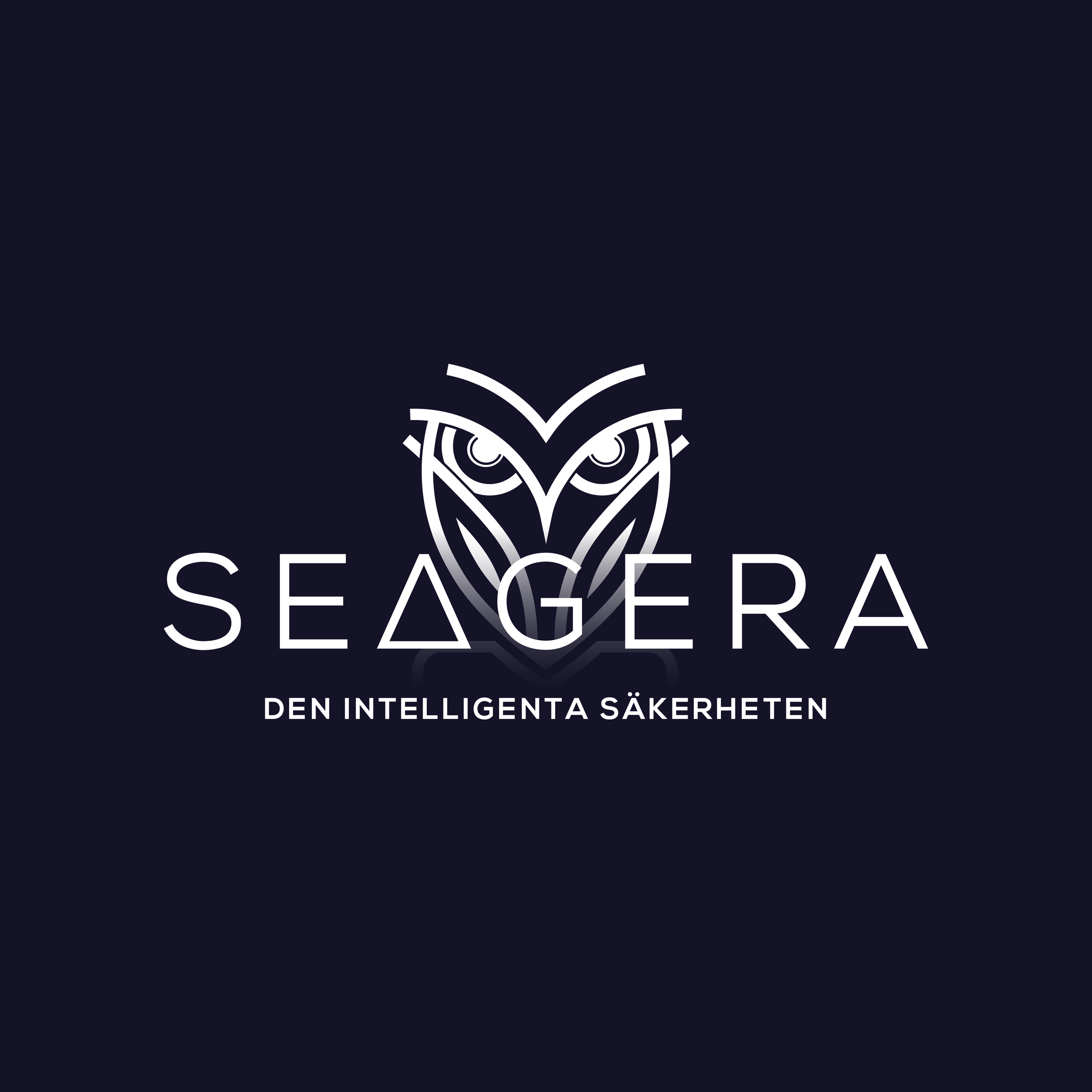
The logo has three parts: an owl, the wordmark SEAGERA and the tagline “Den intelligenta säkerheten” (“Intelligent security”).
It was delivered in 2020 in a light and a dark version, plus a standalone icon that can stand on its own where space is tight.
From the delivery
The colours
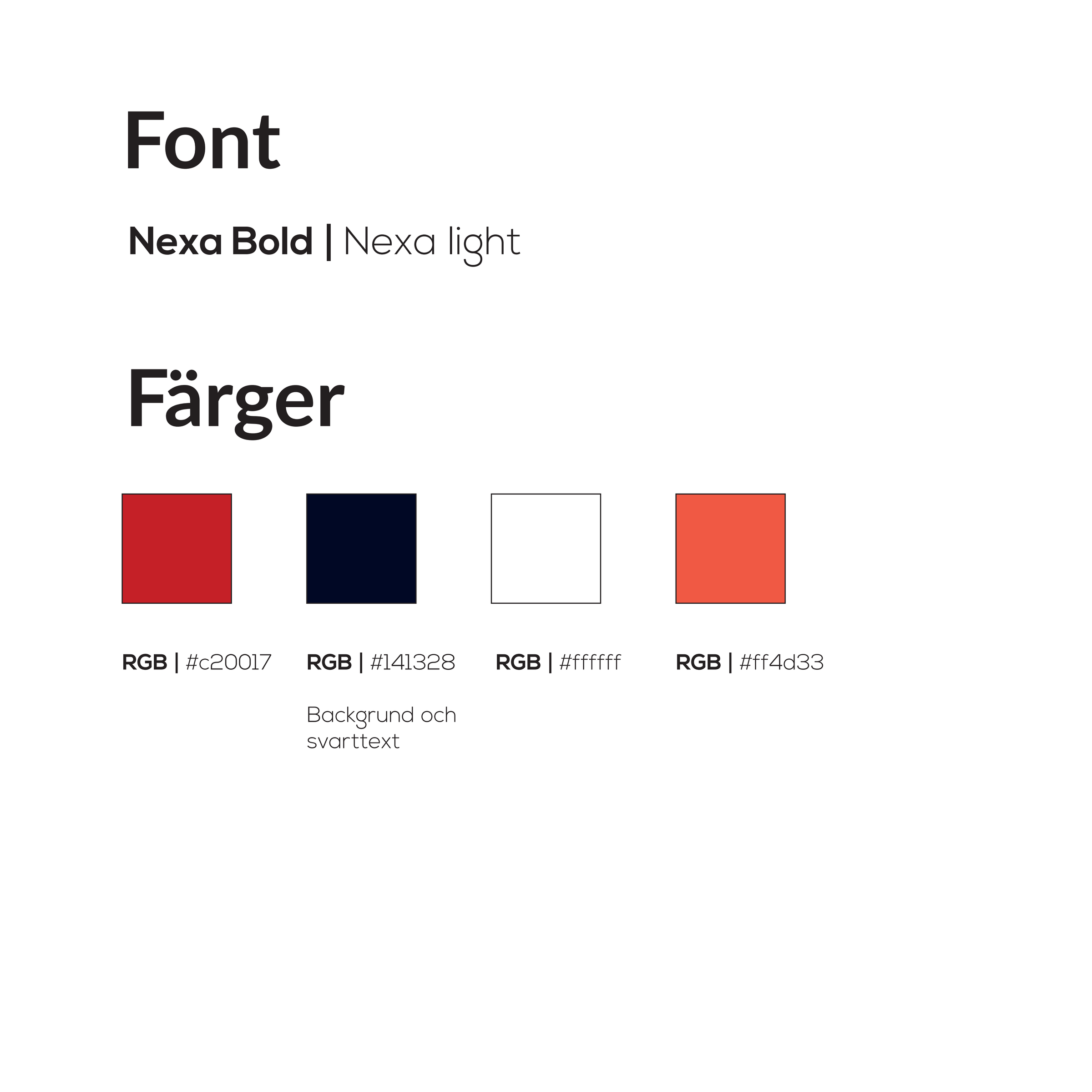
Four colours and two typefaces, Nexa Bold and Nexa Light, fixed in the delivery sheet.
- Red#C20017
- Navy, background and text#141328
- Orange-red#FF4D33
- White#FFFFFF
Our work
- Discovery: A brand identity questionnaire got the company to articulate why it exists, what sets it apart and where it is heading. Those answers became the starting point for both the visual language and the tone of voice.
- Strategy: The identity was built to be read quickly and at a distance — a clear wordmark, a symbol that carries on its own at small sizes, and a palette with enough contrast for outdoor signage.
- Delivery: The logo was delivered in light and dark versions plus a standalone icon, with the tagline “Den intelligenta säkerheten” (“Intelligent security”), the typefaces Nexa Bold and Nexa Light, and a fixed colour palette. The identity was then applied to warning signage and the product copy.
The sign
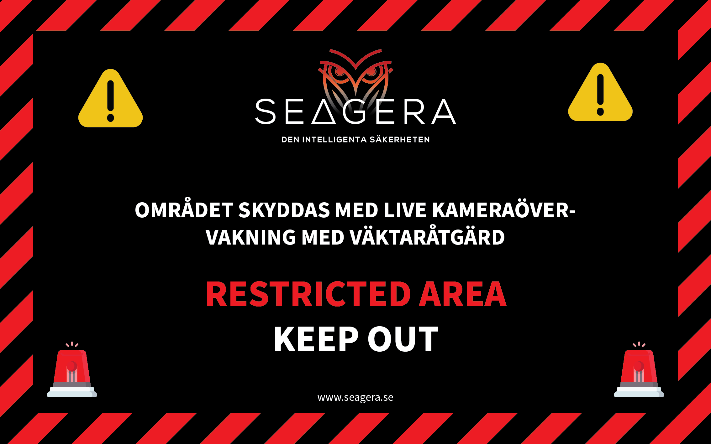
The warning sign says the same thing in Swedish and English: “Området skyddas med live kameraövervakning med väktaråtgärd” (this area is protected by live camera surveillance with guard response) and “Restricted area – Keep out”.
The owl, the tagline and the web address are all there, inside a border of red and black warning stripes.
The owl out in the real world
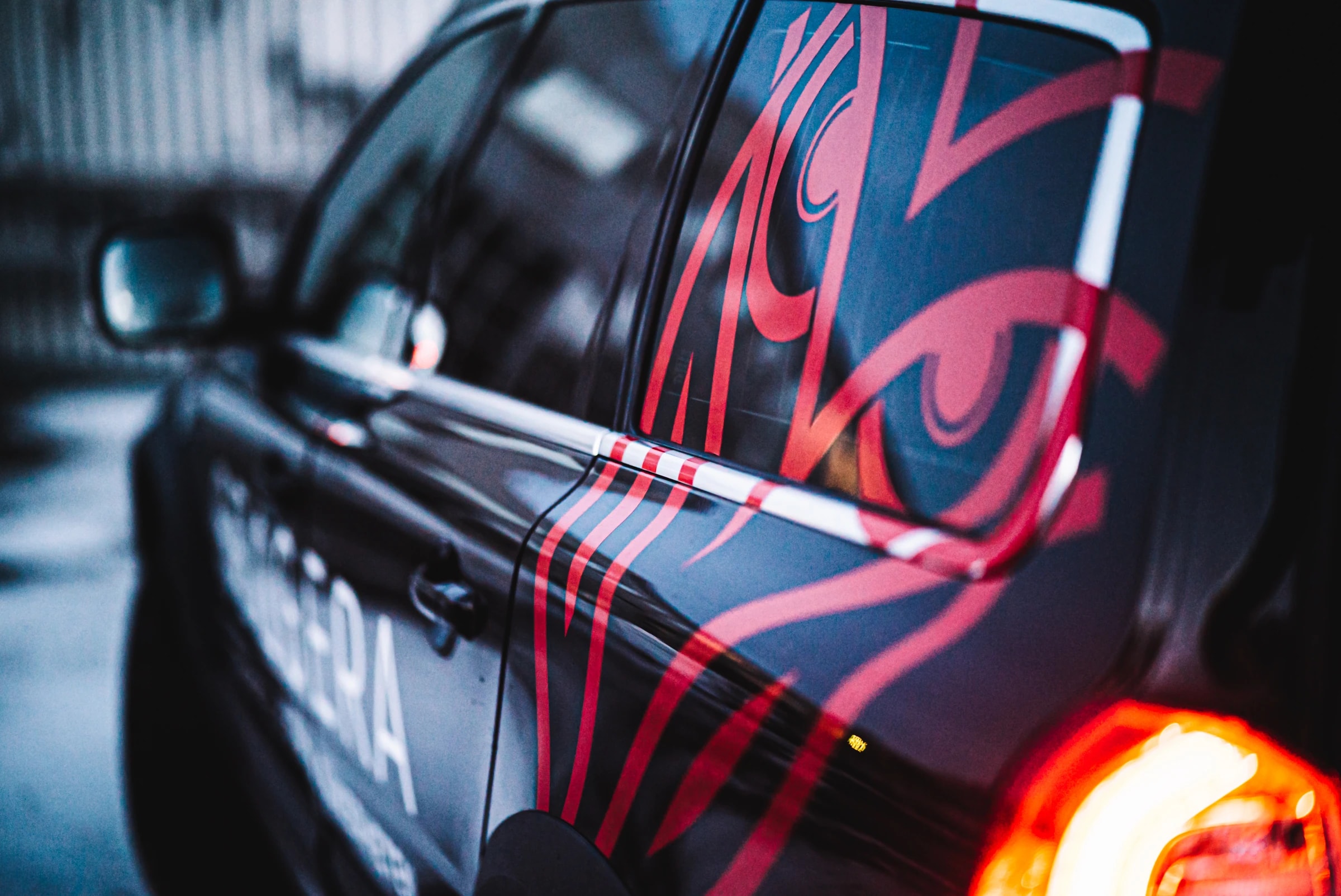
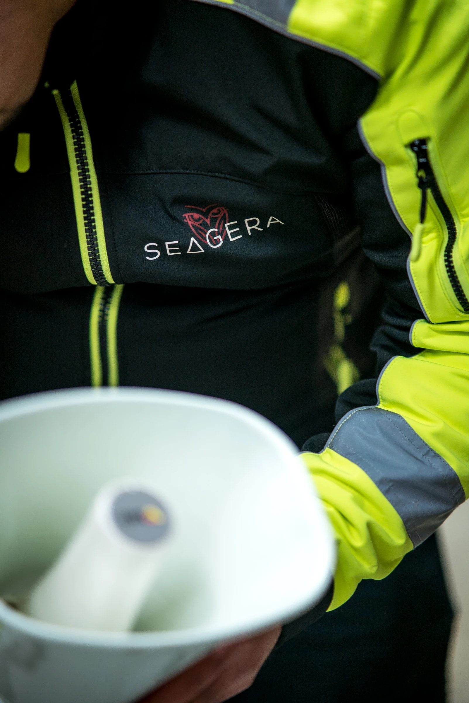
This is how the identity looks where it is used: in the wrap on a car and on the chest of a work jacket.
On site
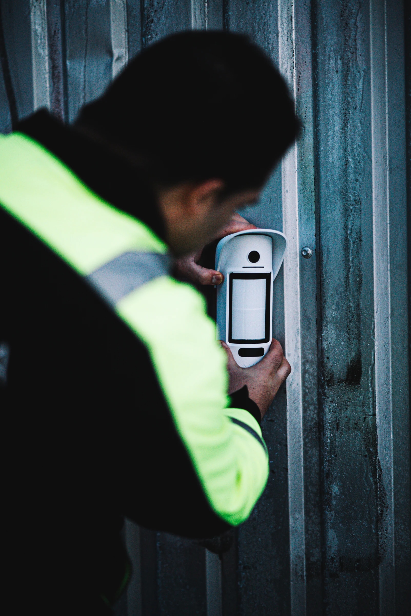
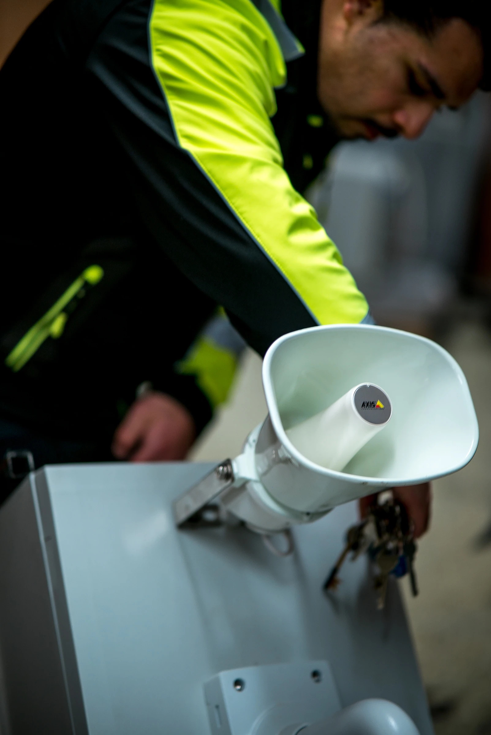
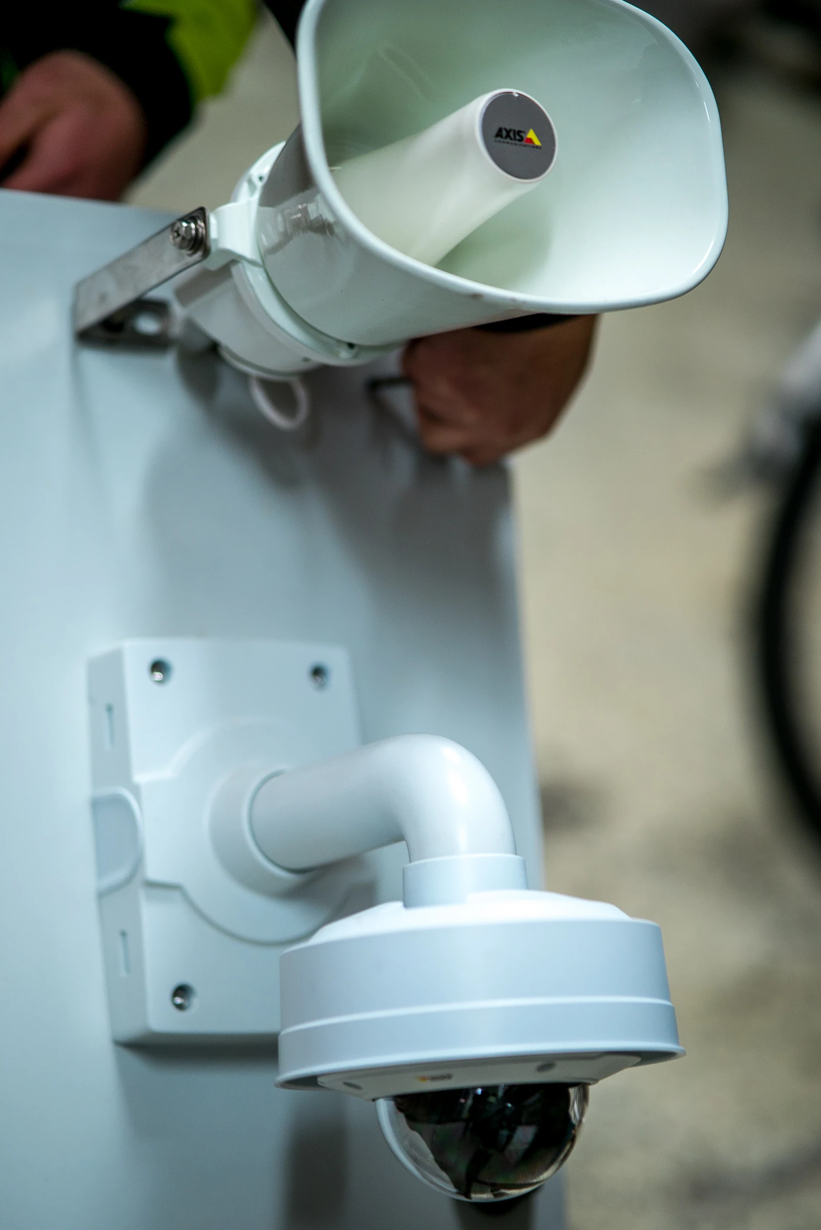
The photos are from a 2022 shoot, with technicians fitting the equipment.
What we built
- Logo in light and dark versions plus a standalone icon — symbol, wordmark and the tagline “Den intelligenta säkerheten”
- Typography and colour palette fixed in a delivery specification: Nexa Bold and Nexa Light, with #C20017, #141328, #FF4D33 and white
- Warning signage for monitored sites — “This area is protected by live camera surveillance with guard response” in Swedish and English, with the web address
- Structure and copy for the product pages — a repeating pattern of intro, highlights, security, specifications and use cases, based on the client's brief
Typefaces
- Nexa Bold
- Nexa Light
More projects
Got a similar project?
Tell us what you want to achieve and we'll come back with how we'd approach it.
Book a free consultation