Powerplant – a green brand for green outdoor spaces, gathered in one manual
A logo doesn't get far if nobody knows how to use it. That's why Powerplant got the whole identity in one manual: colours, typefaces, icon and clear “don't do this” rules.
Summary
Powerplant works with outdoor environments, from consulting and design to construction and maintenance, for households and businesses alike. The company is based in Alingsås and works across West Sweden. We created Powerplant's visual identity: a logo with a leaf in the P, an icon for apps and the web, a green colour palette and typefaces for print and web. Everything was gathered in a 55-page brand manual, so the identity can be used correctly whoever makes the next print piece or post.
The brief
Powerplant helps households and businesses with outdoor spaces, from consultation and design to installation and maintenance. The manual puts the goal like this: customers should get “sustainable, usable and beautiful outdoor environments”.
We created the company's visual identity and gathered it in a brand manual. The manual opens with a sentence that explains why it matters: “You never get a second chance to make a first impression.”
Three values carry the brand
“At Powerplant we are building a brand that offers the highest quality and environmentally smart solutions,” the manual says. The brand rests on three core values, each with a Swedish and a Latin name:
- Sustainability (Firmitas)
- Usability (Utilitas)
- Beauty (Venustas)
The logo: a leaf in the P
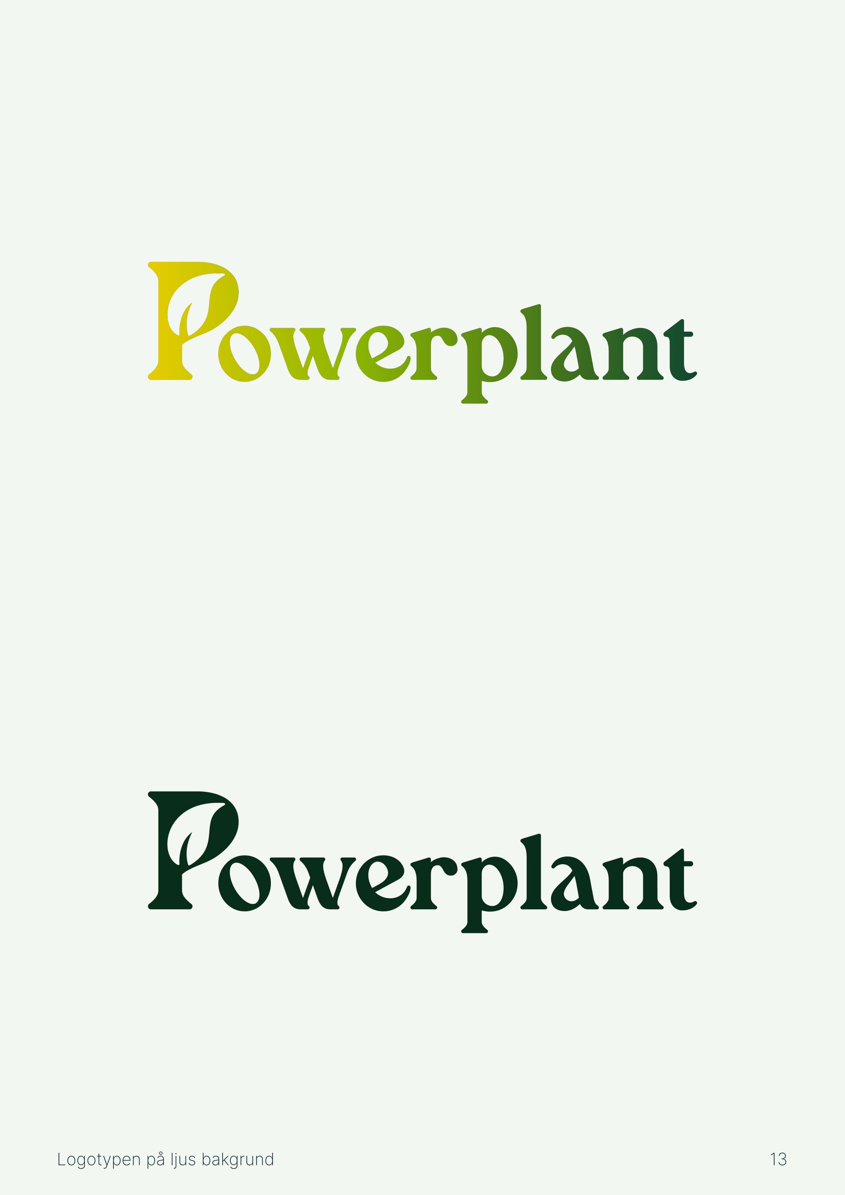
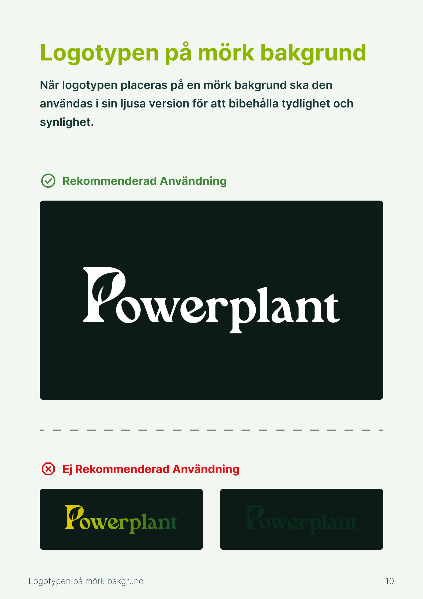
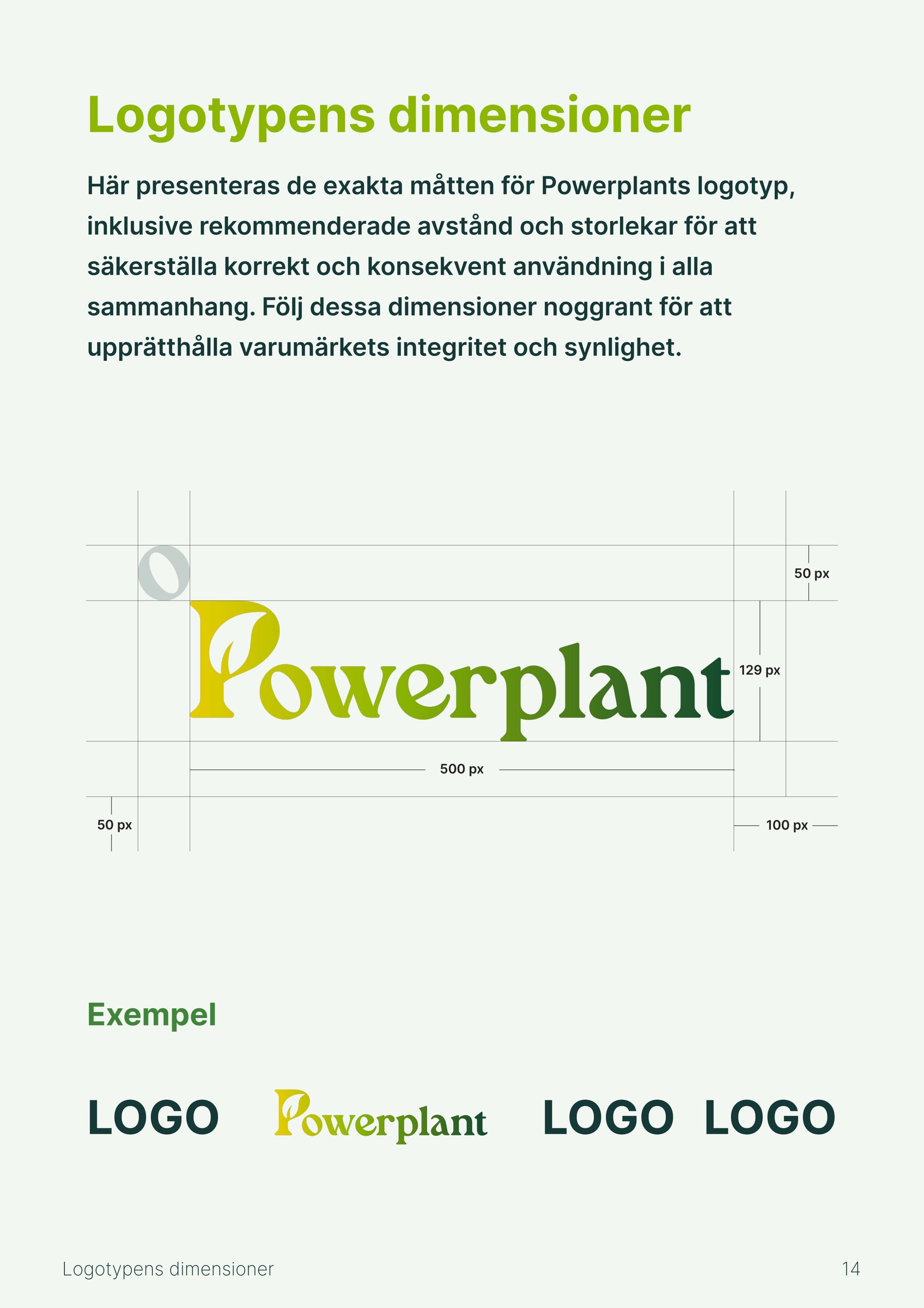
The wordmark has a leaf built into the P, and its colour runs from yellow to dark green. The manual shows when the light version belongs on a dark background, when the colour or dark version suits a light one, and how much clear space the logo needs around it.
The icon
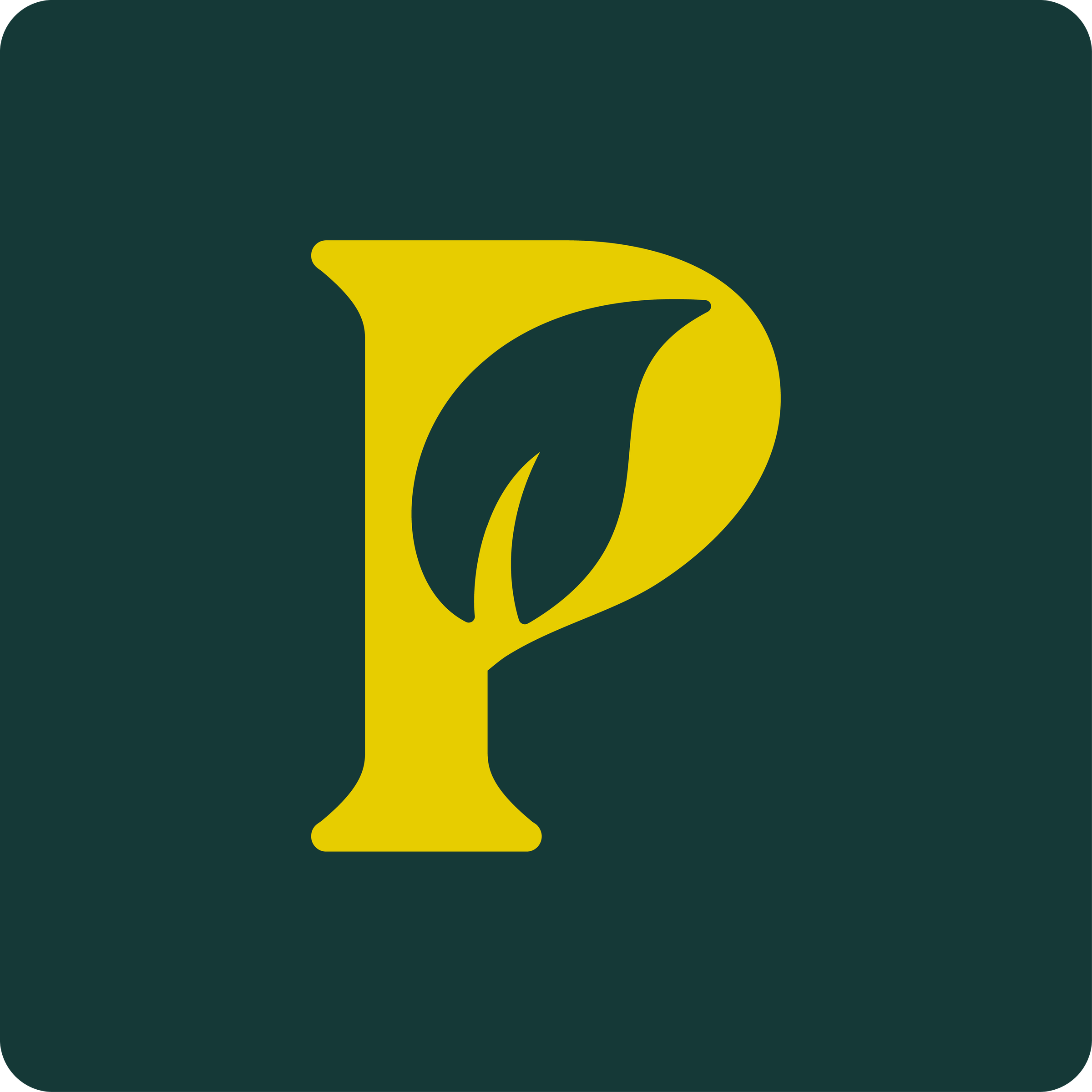
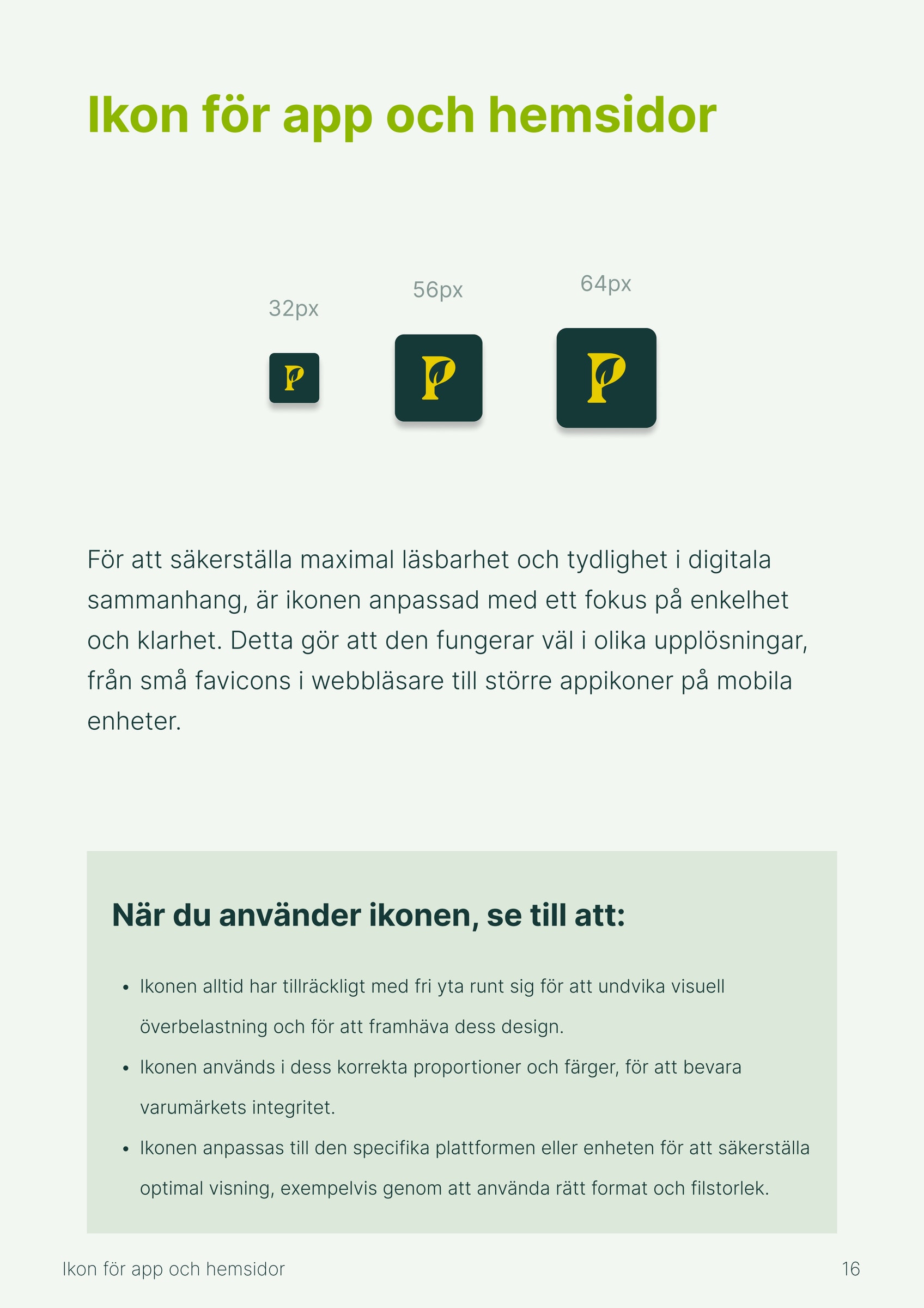
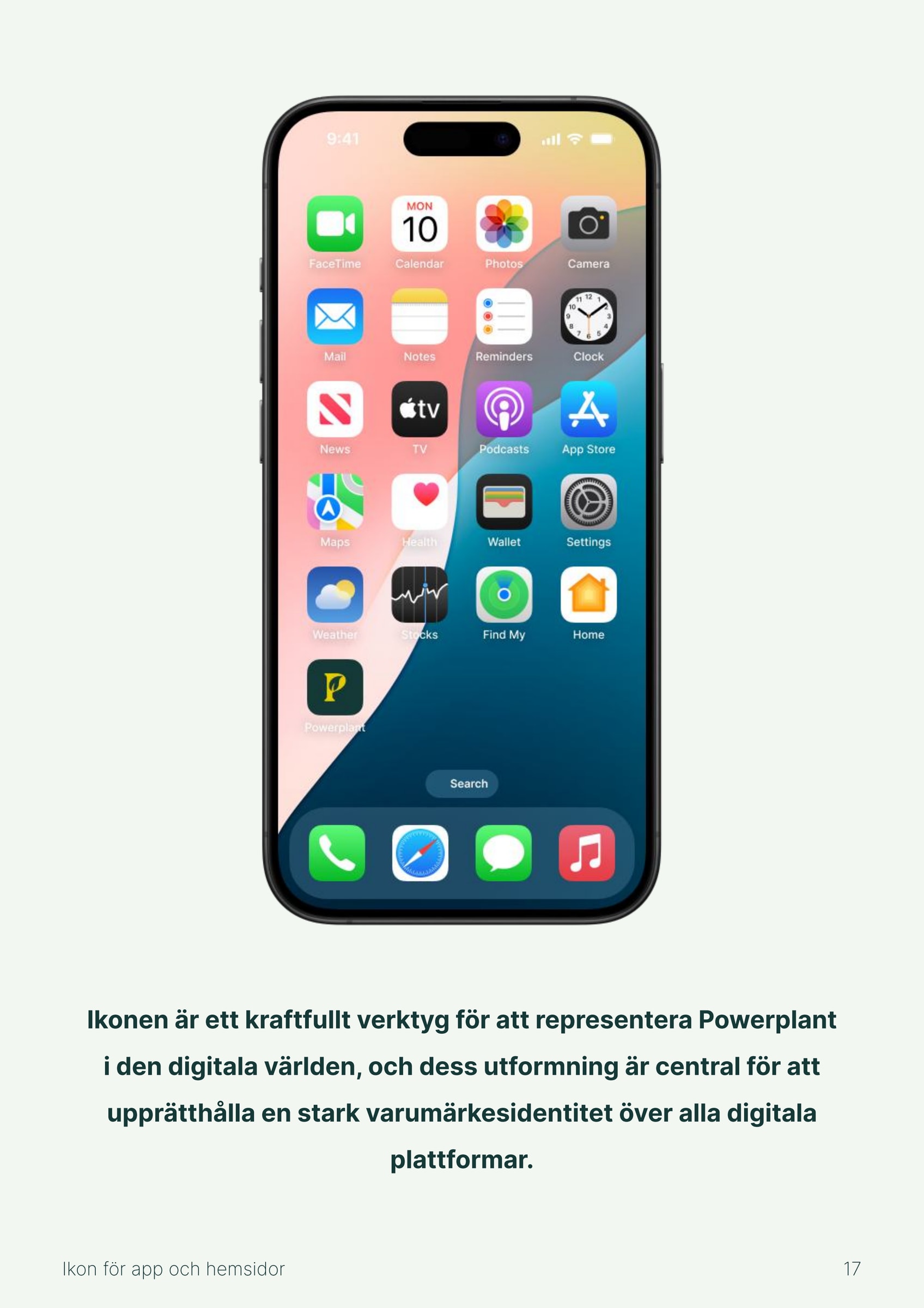
For apps and websites there's an icon: a yellow P with a leaf on a dark green background. The manual describes it as a simplified version of the logo, designed to work well at small sizes. The icon was delivered in sizes for favicon, the App Store, iPhone, iPad and Android.
The colour palette
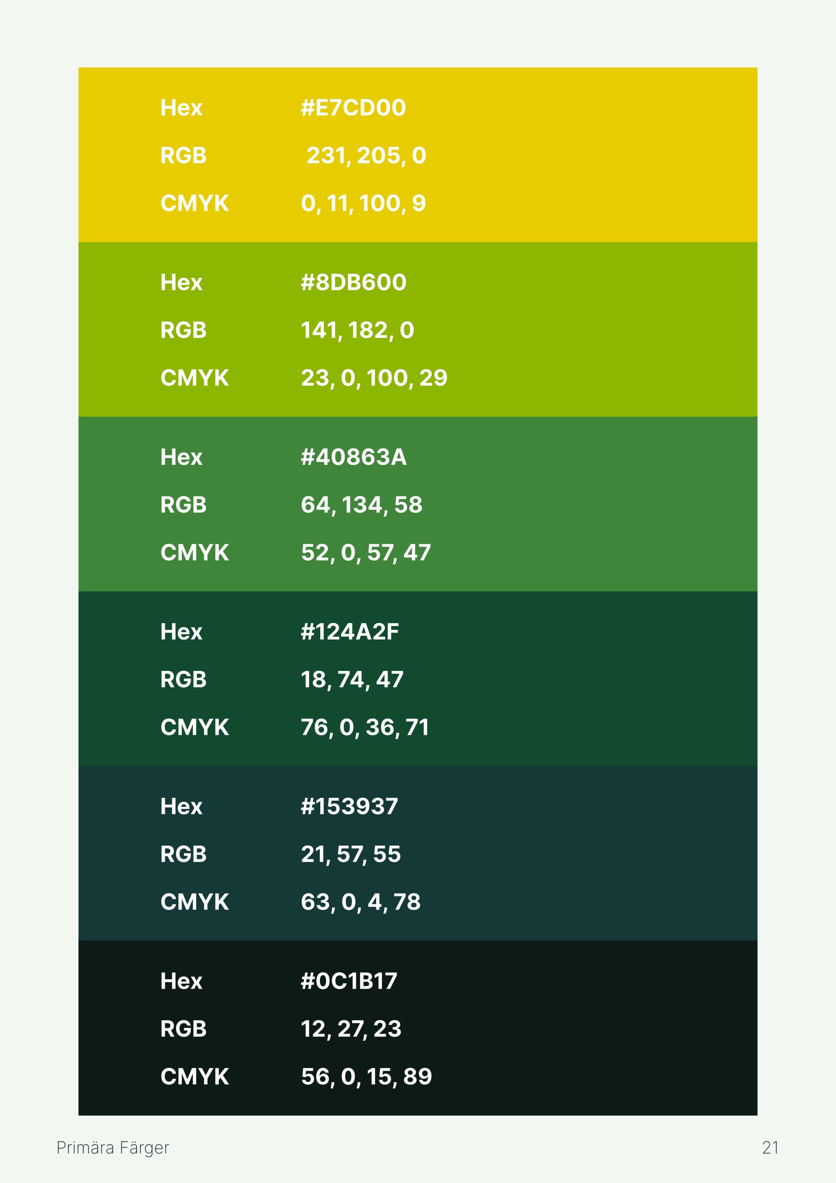
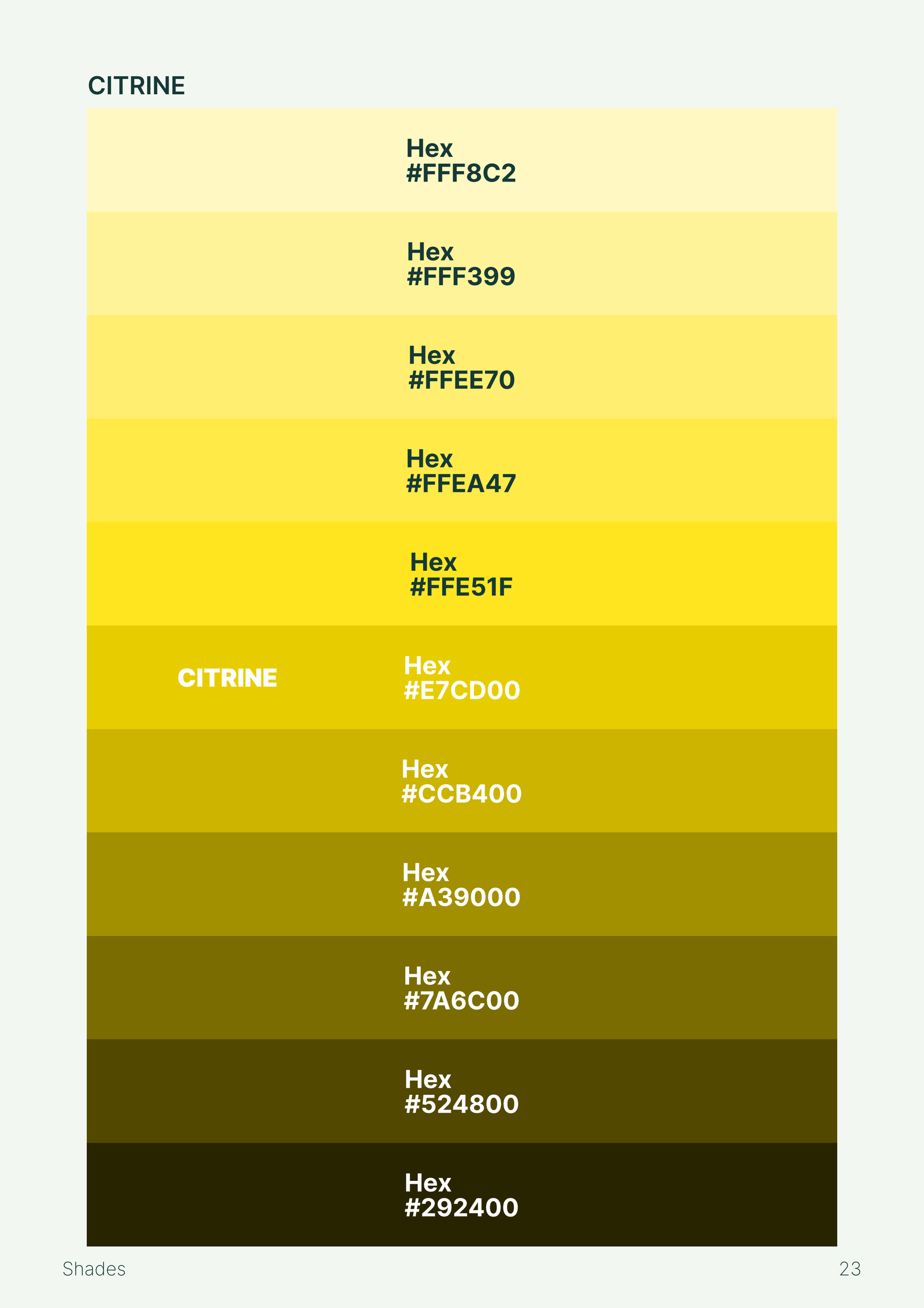
Six primary colours, from light yellow to an almost black green. The names are the ones used in the manual. Each colour also has a scale of lighter and darker shades.
- Citrine#E7CD00
- Apple Green#8DB600
- Forest Green#40863A
- Parsley#124A2F
- Dark Slate Gray#153937
- Earie Black#0C1B17
Colours that work together
The manual gives the colour codes and shows which combinations work, for example Citrine on Dark Slate Gray, or a heading in Apple Green with body text in Dark Slate Gray on white. It also sets out light and dark background colours and six greys.
Typography
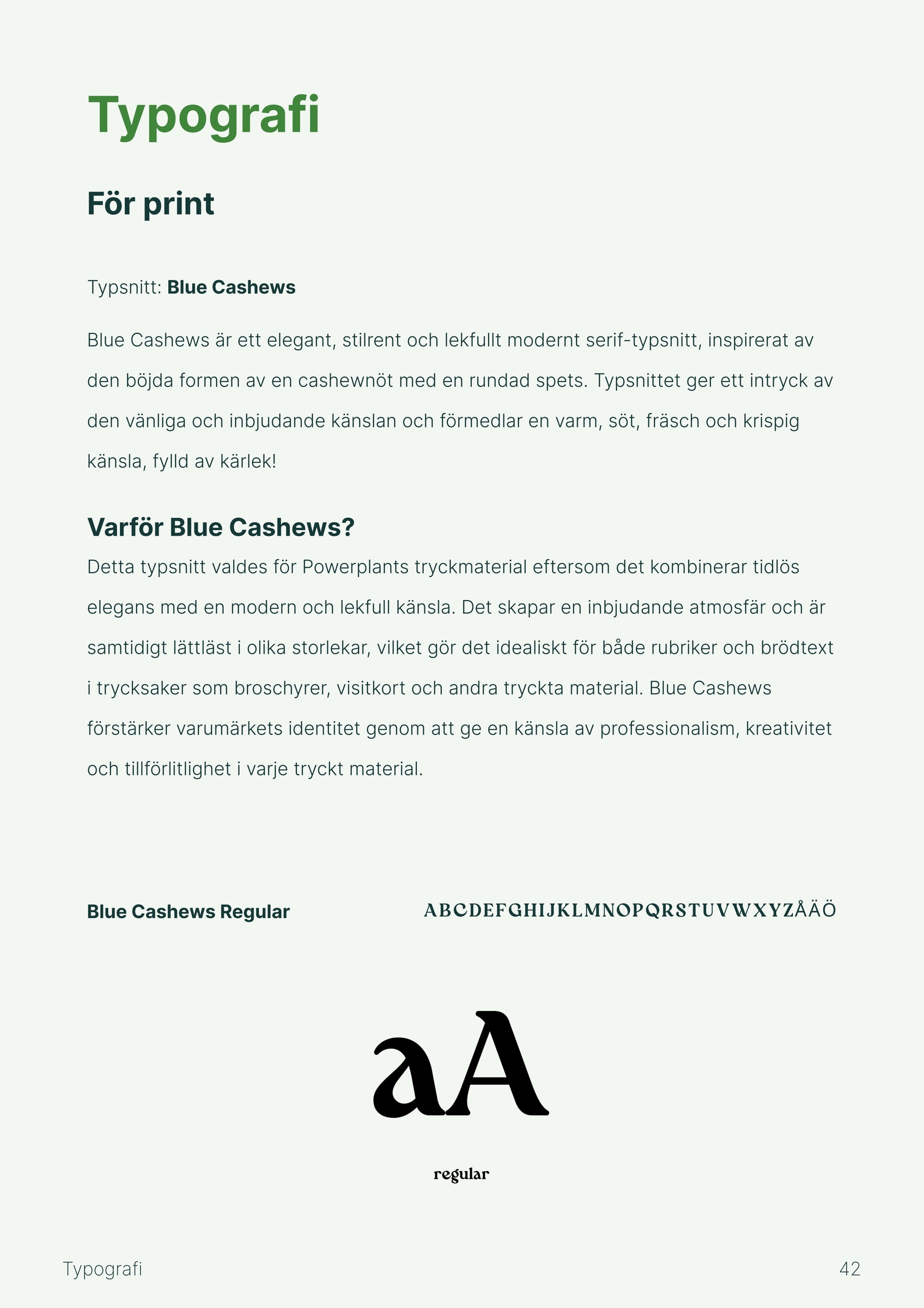
Two typefaces with clear roles. Blue Cashews, a serif, is for print. Inter is for the web.
For the web there's a ready-made type scale, from headings at 64 pixels down to body text at 14 pixels. Whoever builds a web page doesn't have to guess sizes.
Don't do this
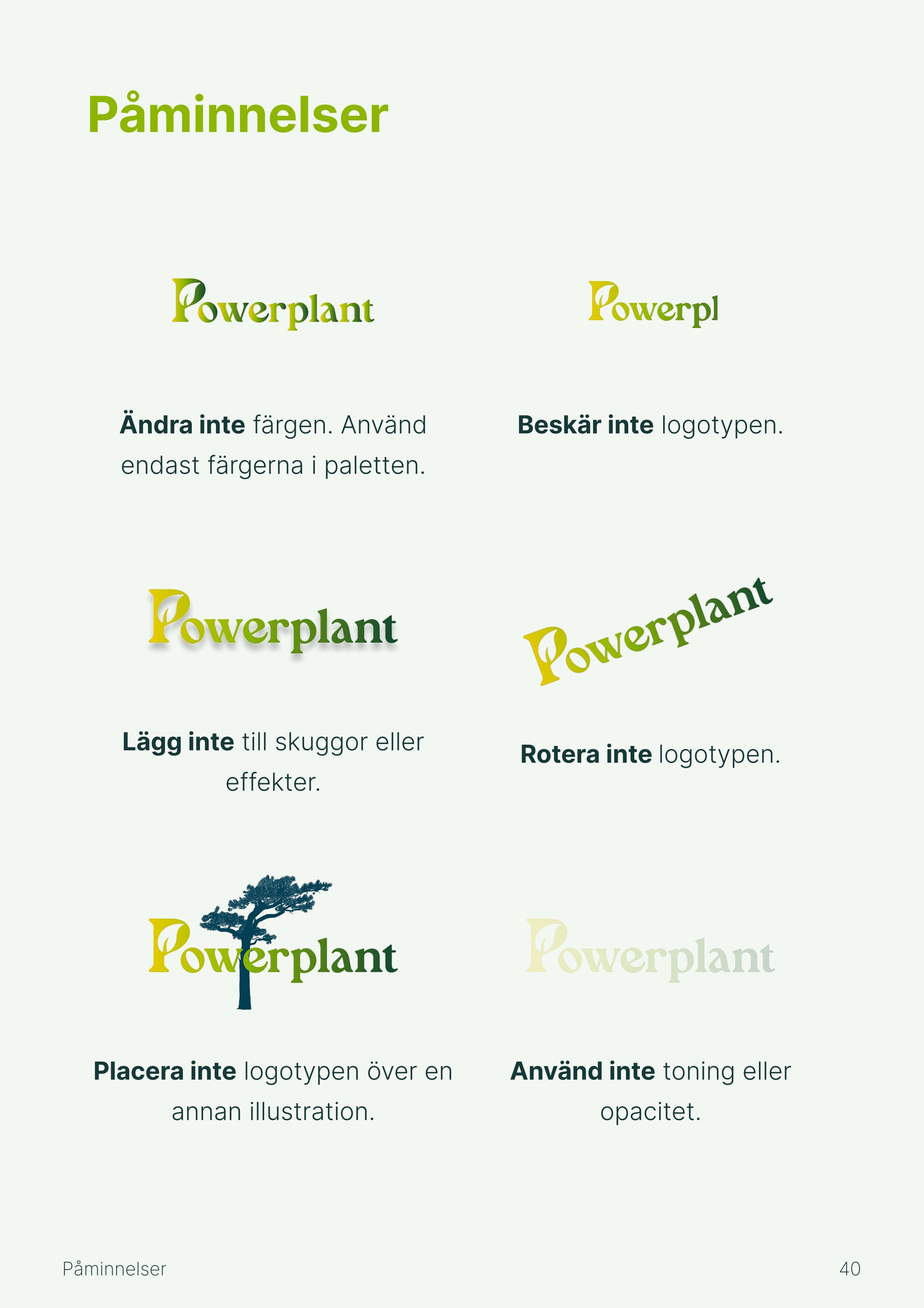
A manual should make it easy to get things right. That's why Powerplant's manual also shows what to avoid, with an example of each mistake.
Don't change the colour. Don't crop the logo. Don't rotate it. Don't add shadows or effects. Don't place it over another illustration. Don't use tints or opacity.
Simple rules like these are what make the logo look the same on a sign as on a screen.
Imagery and Instagram
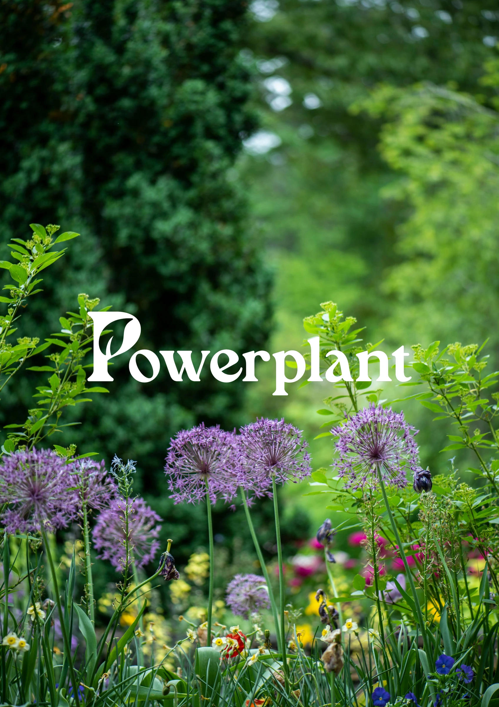
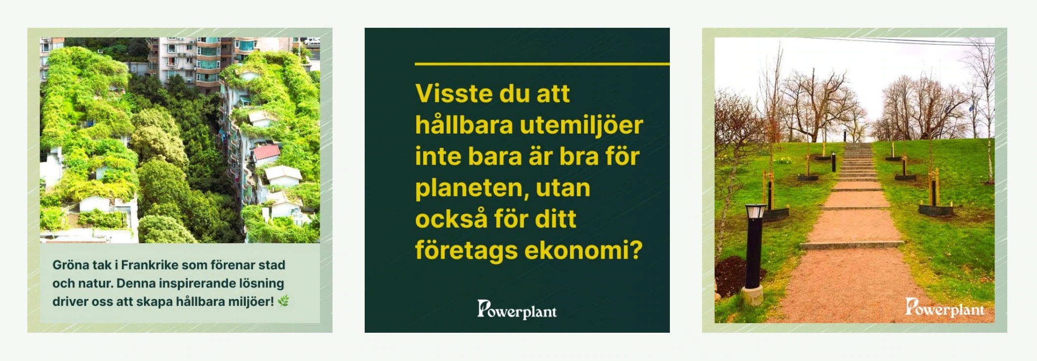
According to the manual, photos should be “harmonious”, “authentic” and “down-to-earth”. The manual shows how the logo is placed on top of a photo, and gives examples of Instagram posts in the company's colours and typefaces.
The identity in use
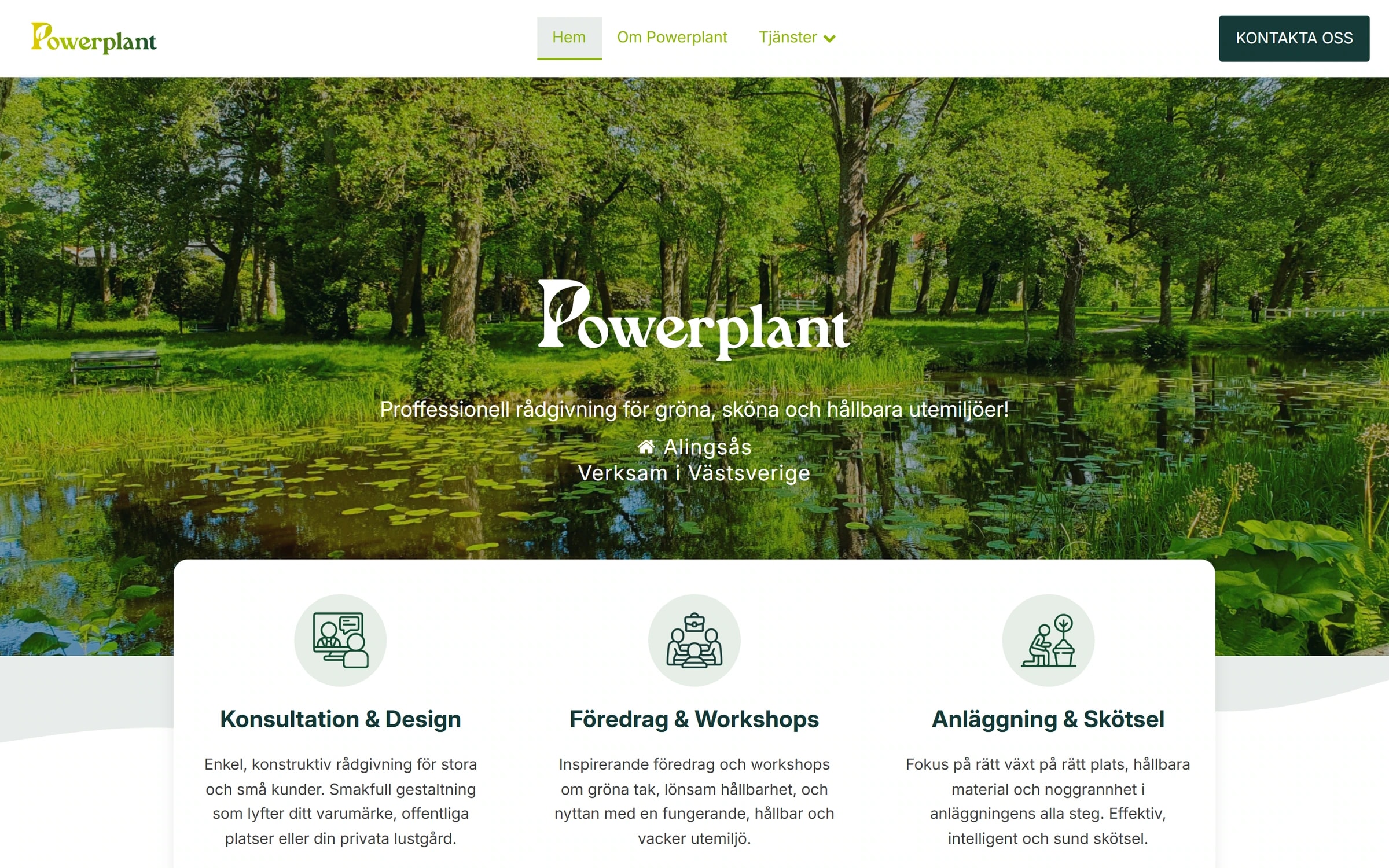
The logo, the colours and Inter are used today on Powerplant's website, powerplantsweden.se.
That's how a manual should work: the identity comes along wherever the company shows up next.
What we delivered
- A logo with a leaf in the P, in colour, black and white, as PNG, JPEG, SVG and EPS
- An icon for apps and the web, in sizes for favicon, the App Store, iPhone, iPad and Android
- A colour palette with six primary colours, shade scales, background colours and greys
- Typography: Blue Cashews for print and Inter for the web, with a type scale for the web
- Guidelines for imagery and example Instagram posts
- A 55-page brand manual with rules, “don't do this” examples and all files ready to download
Typefaces
- Blue Cashews (print)
- Inter (web)
More projects


Got a similar project?
Tell us what you want to achieve and we'll come back with how we'd approach it.
Book a free consultation