Kulturföreningen Levande Betong – from a new logo and a sketch to a live site
The sketch we drew in 2016 and the site that was live in 2018 are almost identical. What was in the sketch is what visitors saw.
See the concept live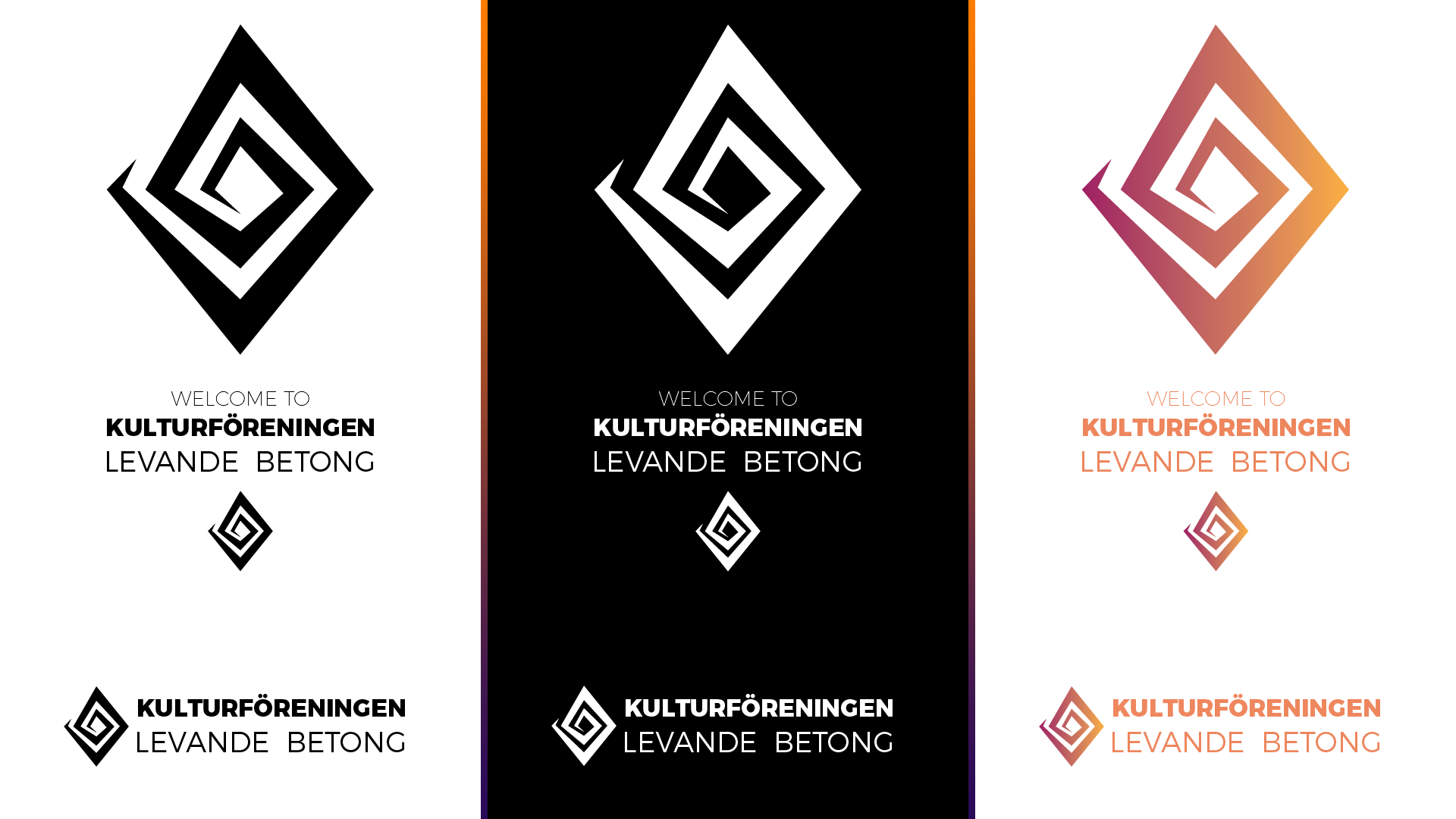
Summary
Kulturföreningen Levande Betong is a nonprofit association in Gothenburg that supports its members in creating cultural projects. In 2016 we drew the association's new logo, a diamond that turns inwards like a spiral, in a gradient from pink to orange. We also designed a new website and a member portal. The same identity was then used on Christmas cards and banners. The website went live with our design and stayed up for at least a year and a half.
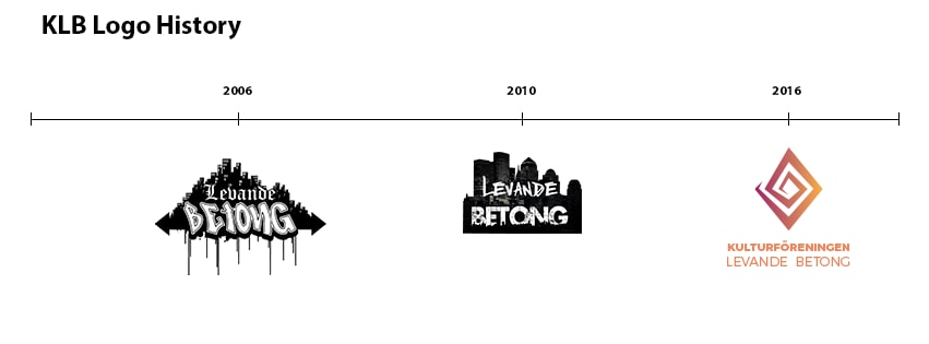
Three logos in ten years
Levande Betong had had two logos before we came in: one from 2006 and one from 2010. Both appear in the timeline here, but they are not our work. Our part started in 2016.
We drew a new symbol: a diamond that turns inwards like a spiral. Next to it sits the name, "Kulturföreningen" in bold and "Levande Betong" in lighter letters, both set in Montserrat.
One logo, several versions
The logo comes as an icon, horizontal, vertical and in a "Welcome to" version, in colour, black and white. The files were delivered prepared for both print and web, and the icon in favicon size too.
Colours and typefaces
The foundation is a gradient from pink to orange. The lettering in the logo is a warm orange, and the typeface is Montserrat. For the website we added an orange scale based on #EA682C, with Lato for body text.
- Pink – gradient start#A22061
- Orange – gradient end#FDB539
- Logo lettering#EC865E
- Website orange#EA682C
From wireframe to live site
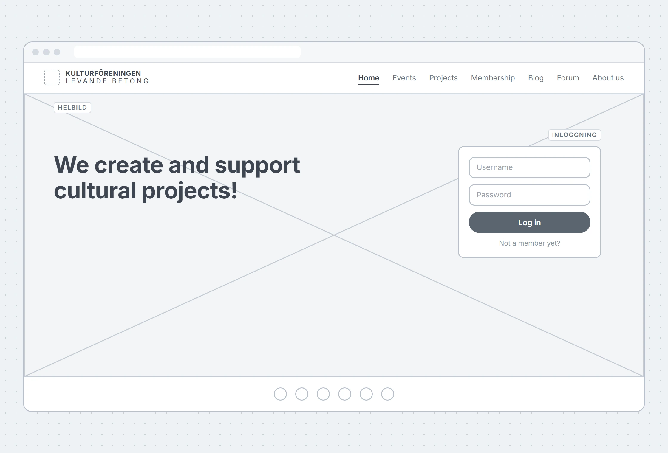
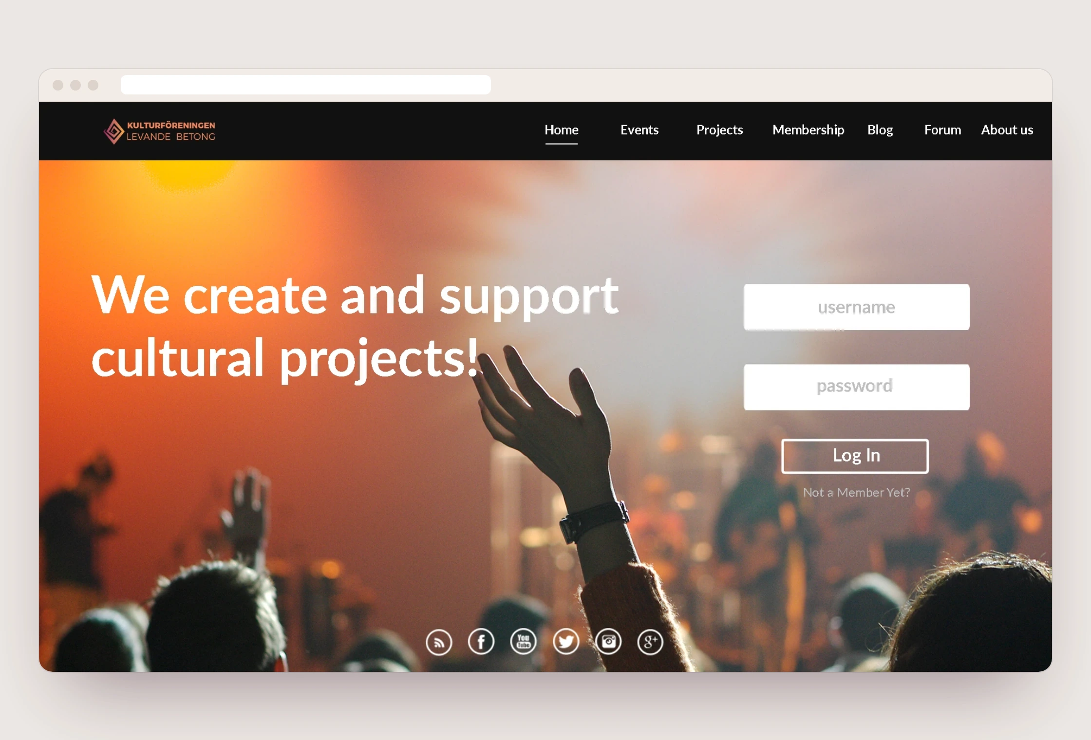
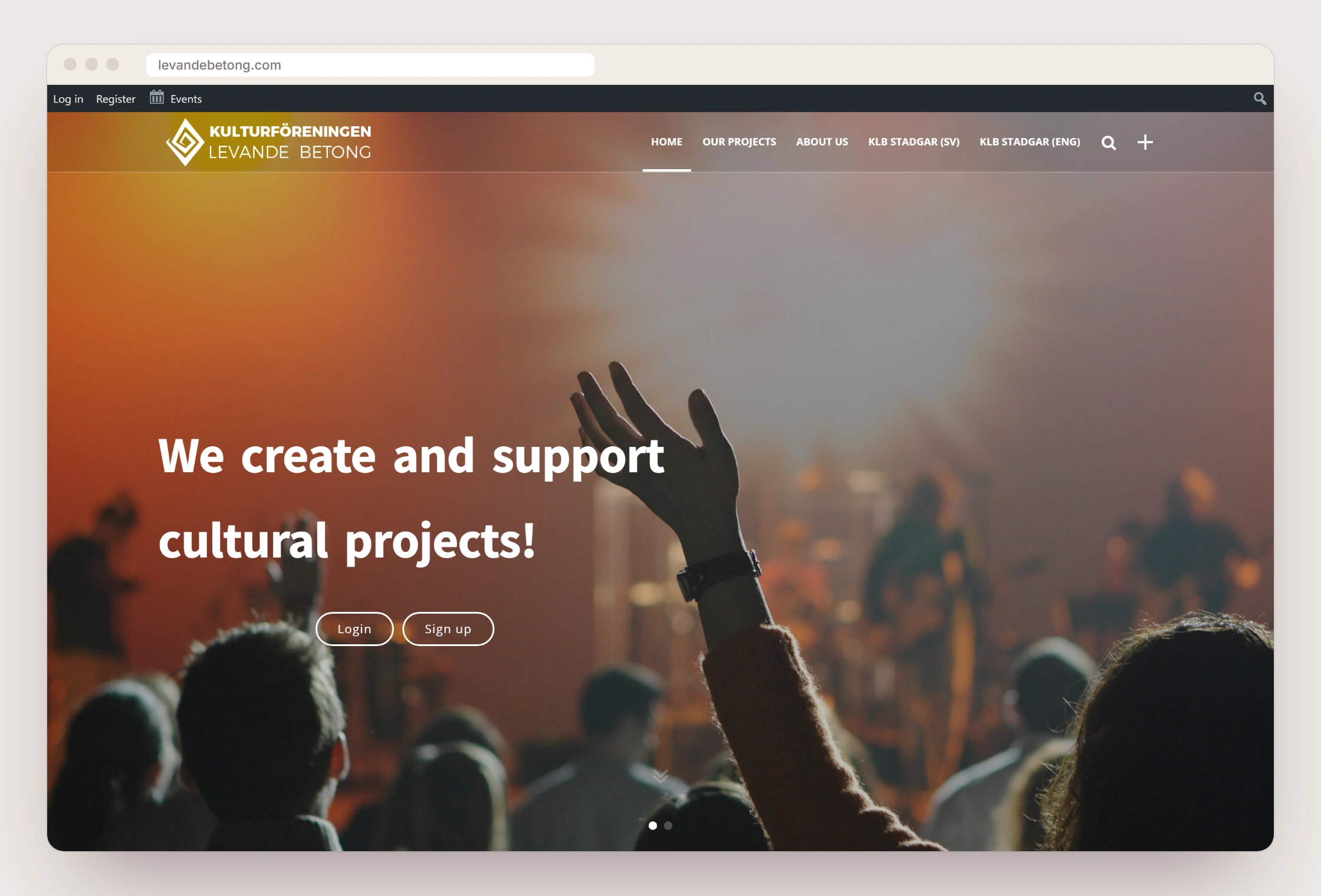
The home page in three steps. The wireframe shows the structure of our sketch: menu, full-width photo, headline and login. The sketch is our 2016 design. The launched page, saved by the Internet Archive in May 2018, has the same headline, concert photo and logo. The menu got shorter, and the login box was replaced by two buttons. The site was built in WordPress on a bought theme with our design on top, and according to the Internet Archive the home page stayed unchanged until December 2019.
The same identity, a new design
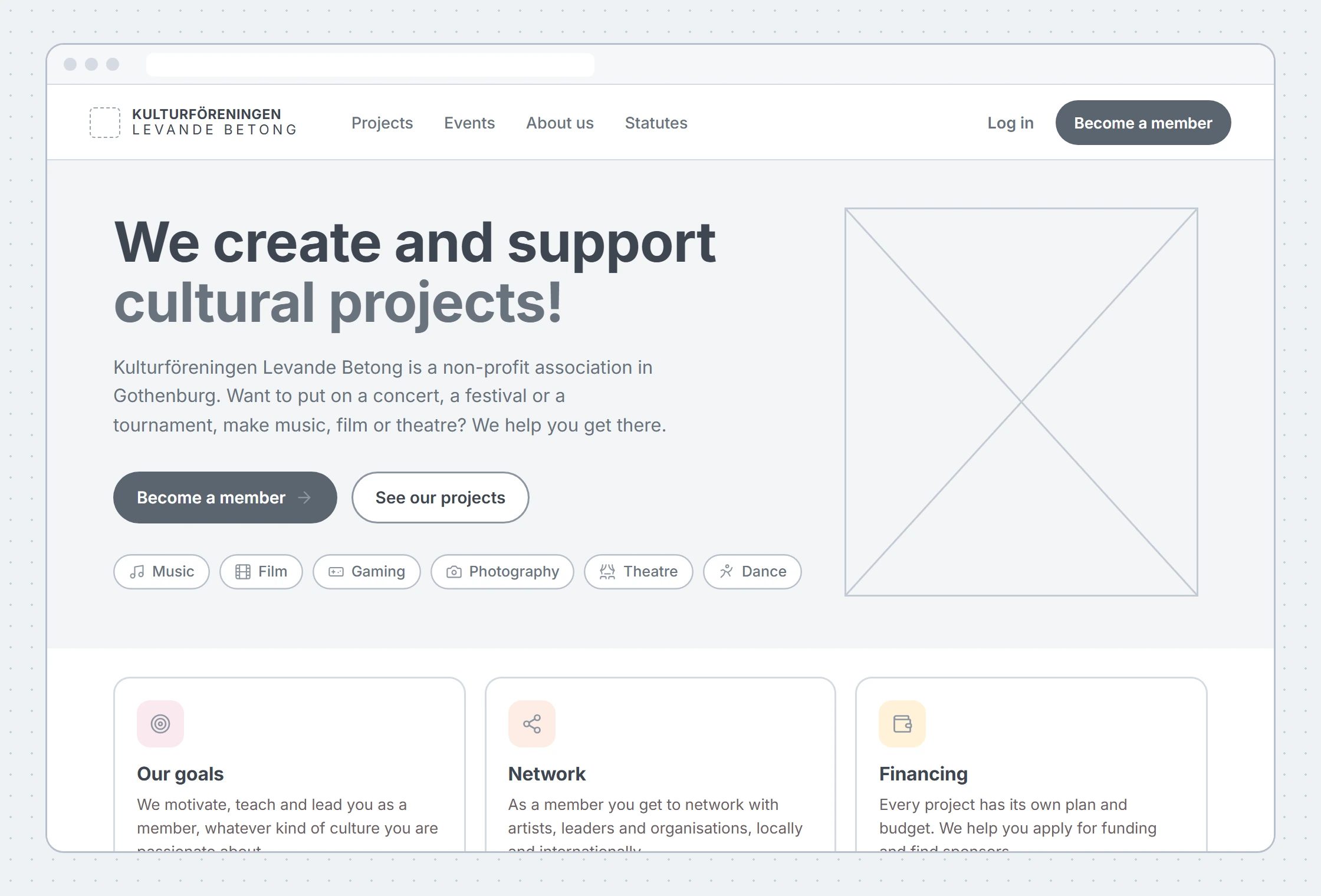
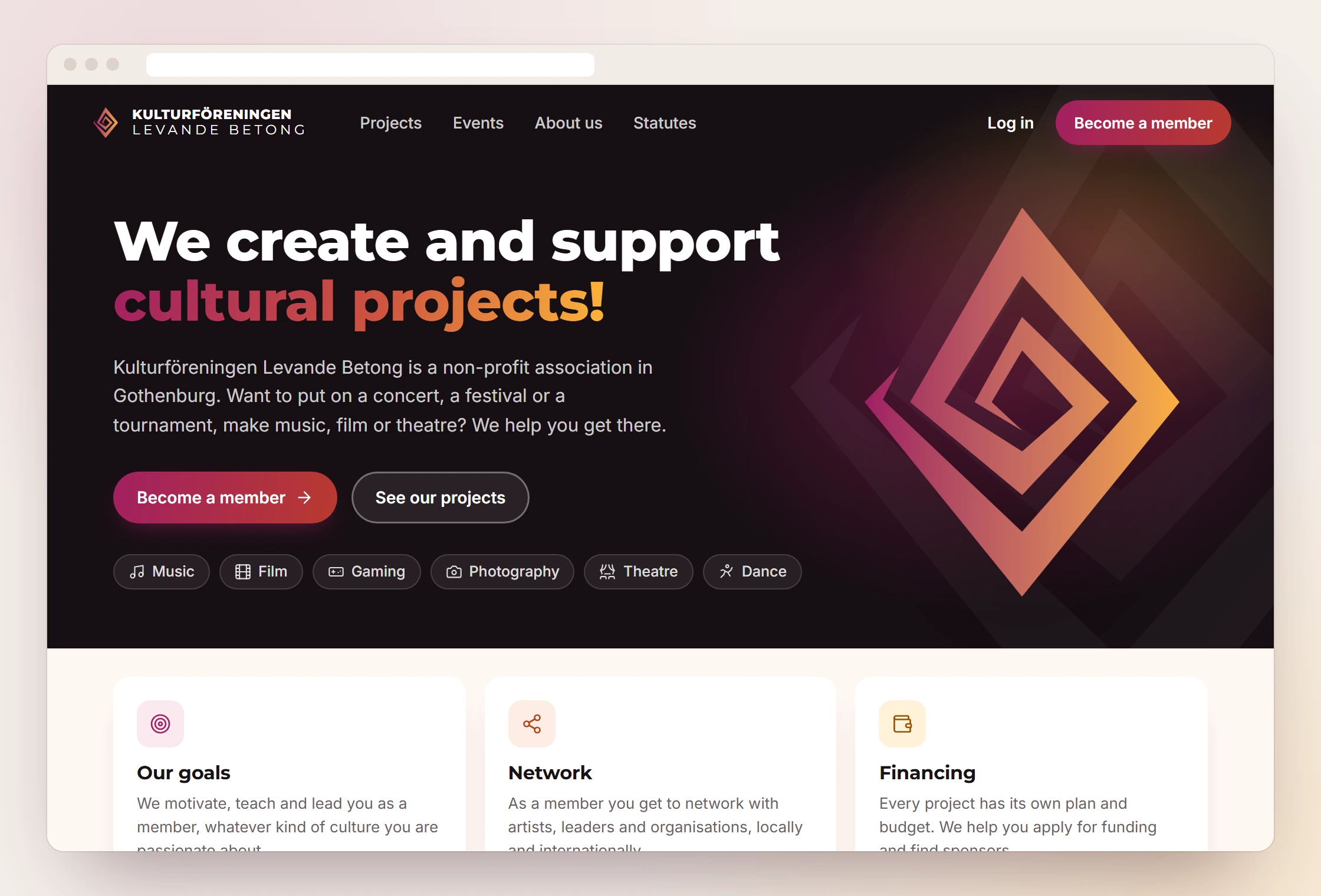
Ten years on, we redrew the same pages to show how we would make them today. The logo, the gradient and Montserrat for headings stay. Body text is set in Inter instead of Lato, text and buttons are larger, every field has a visible label, and the phone gets a menu at the bottom, where the thumb reaches.
Each page is shown in three steps: the original, a wireframe and the new design. The text on the pages comes from the association's own website and our sketches. The redesigns are a 2026 concept and have not been launched.
The concept also exists as a working page, with the logo in 3D and animation that follows the scroll.
See the concept liveThe home page
The concert photo, which was not ours, is gone. Instead the logo carries the page, large and in the gradient. The button for becoming a member comes first, and the categories are visible straight away.
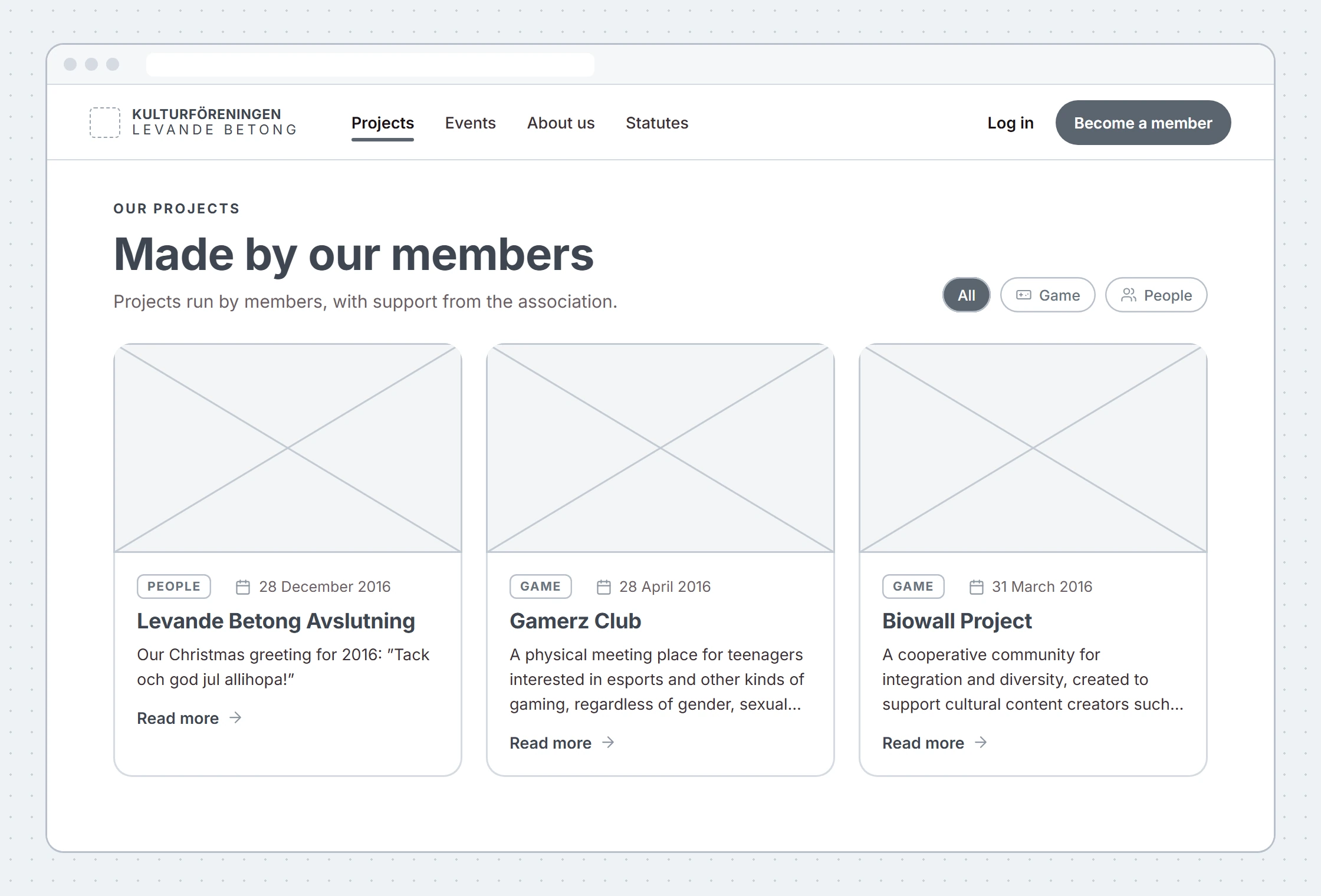
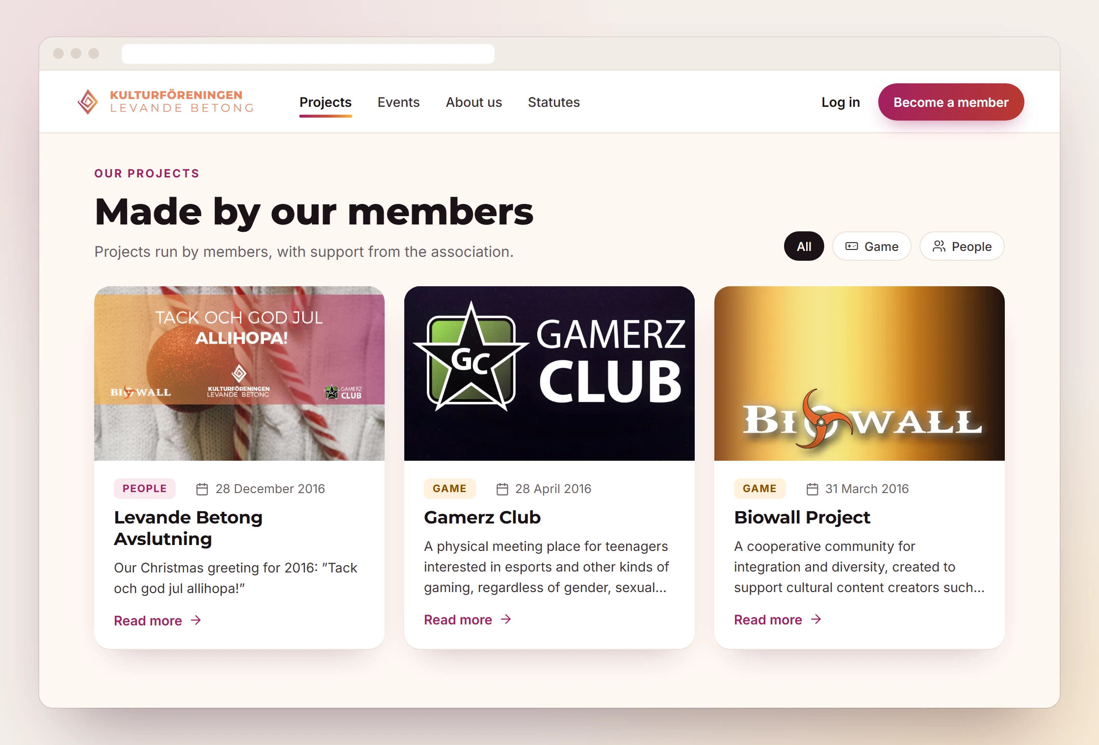
The projects page
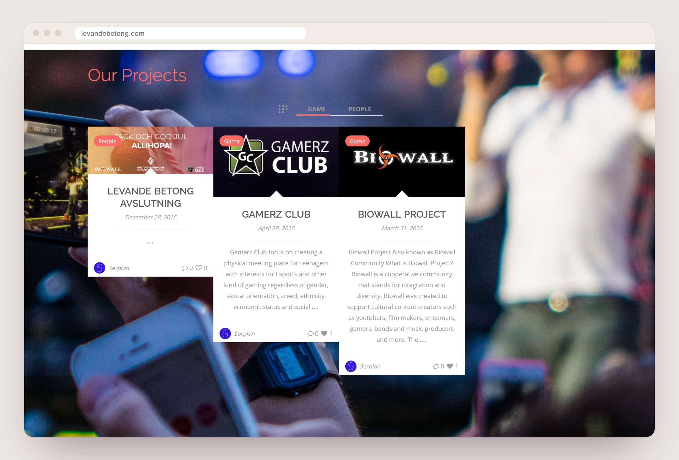
The cards sit on a calm background instead of a blurred photo. Each card has a category, a date, a short text and a clear link, and the Game/People filter from the original stays.
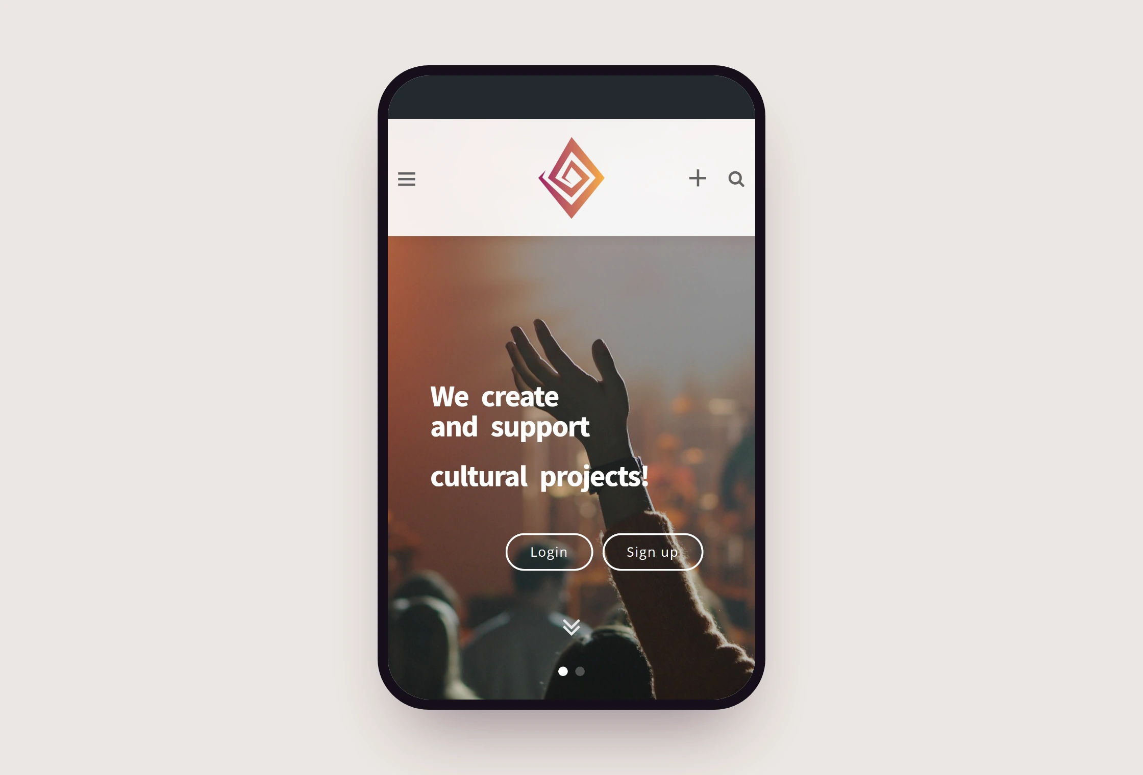
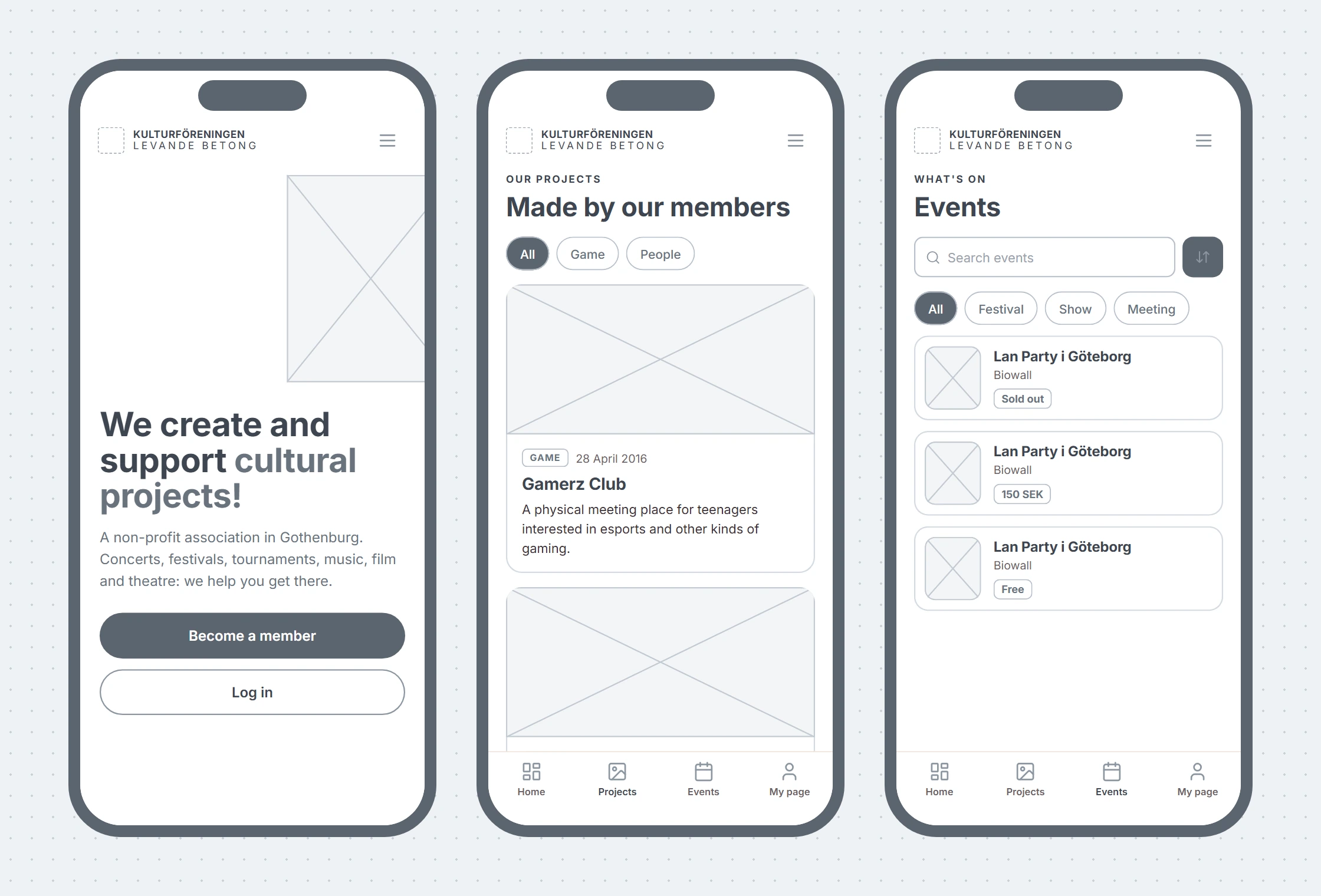
On the phone
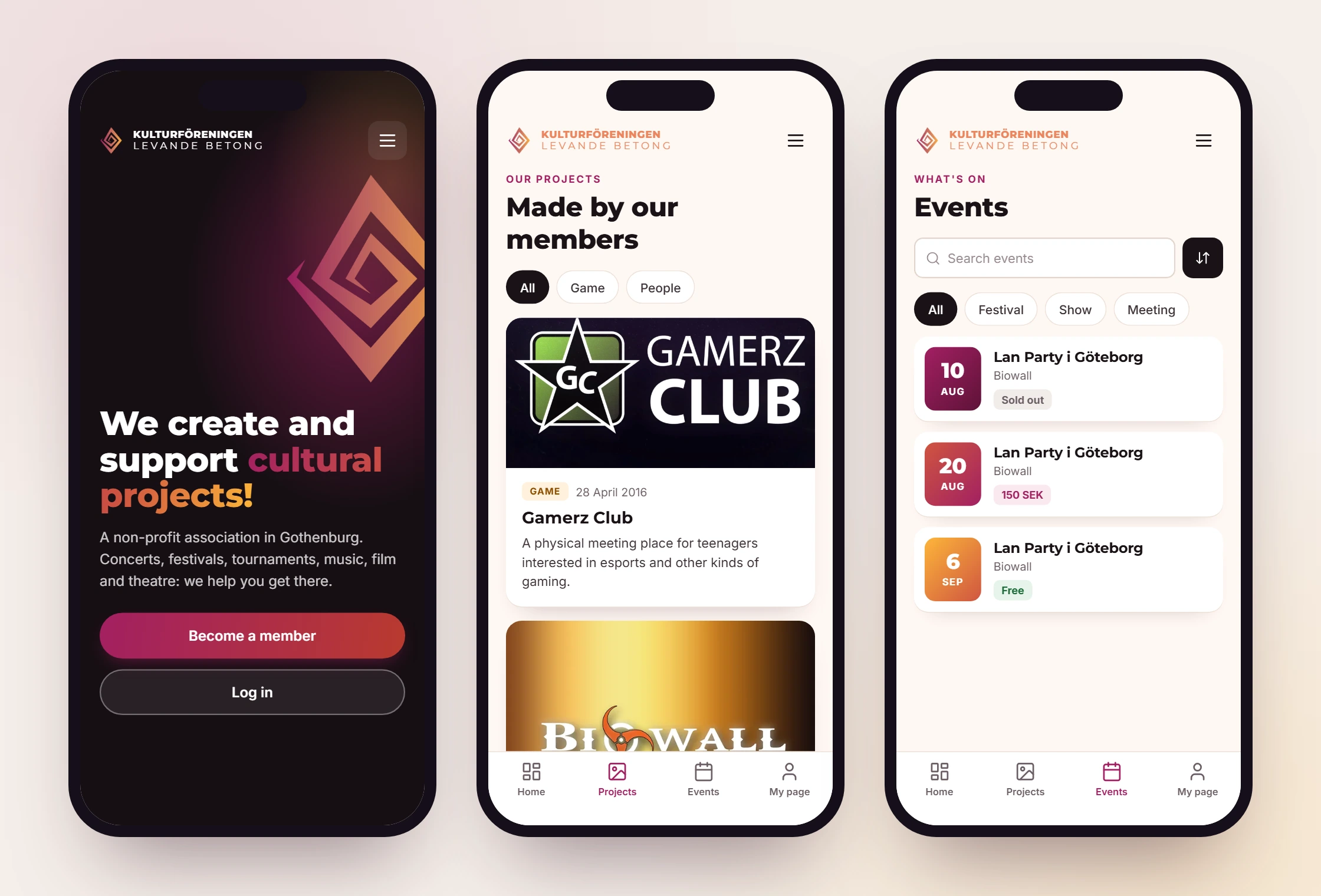
In the 2018 mobile view the concert photo filled the screen and the buttons were small. The new one is designed for the phone from the start: full-width buttons and a bottom menu with Home, Projects, Events and My page.
Events
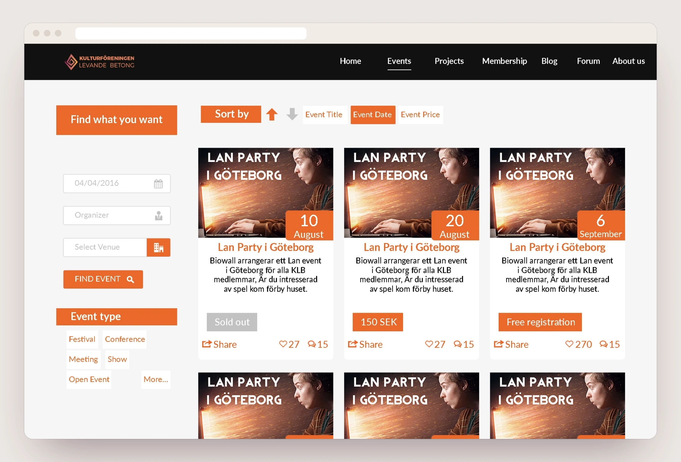
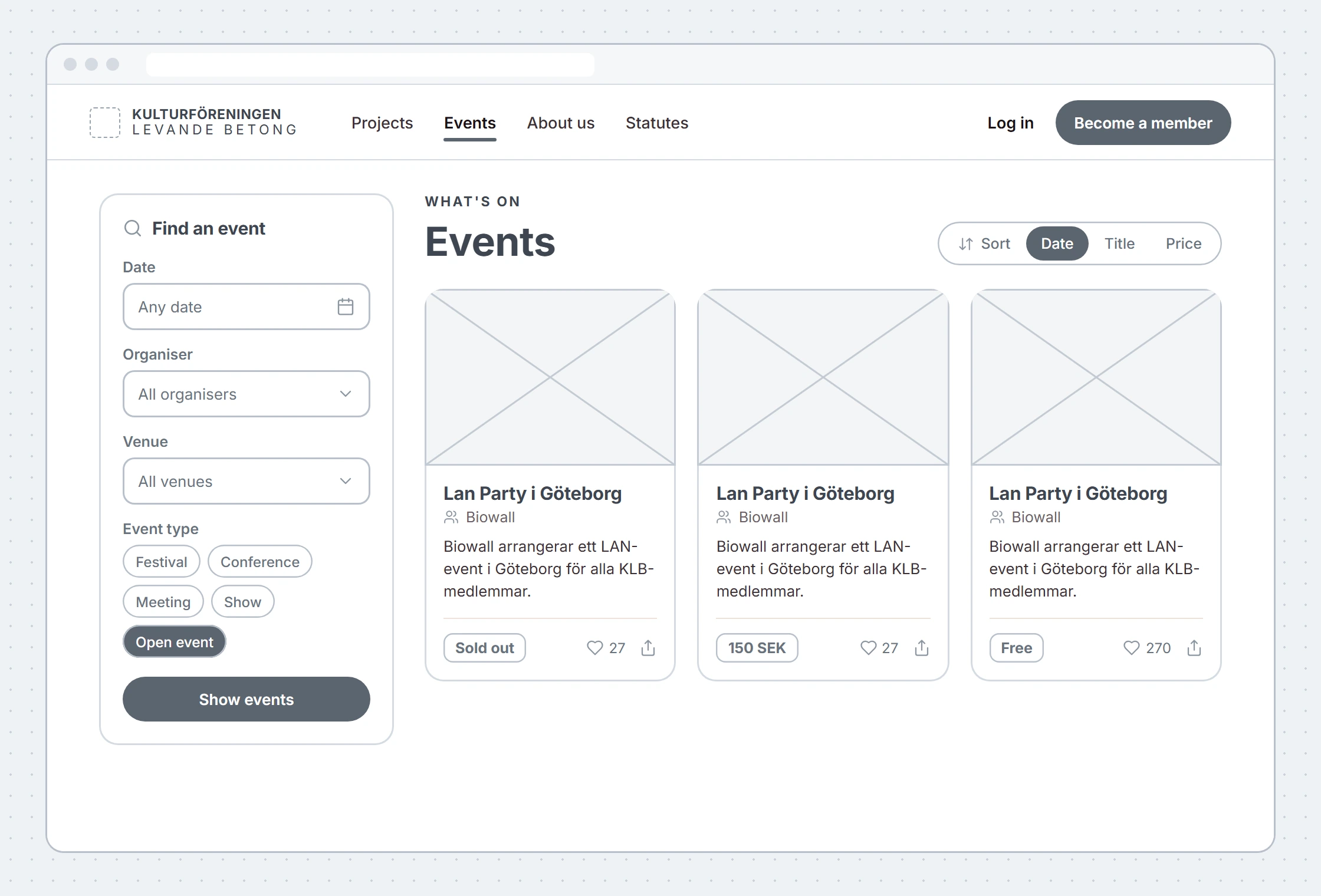
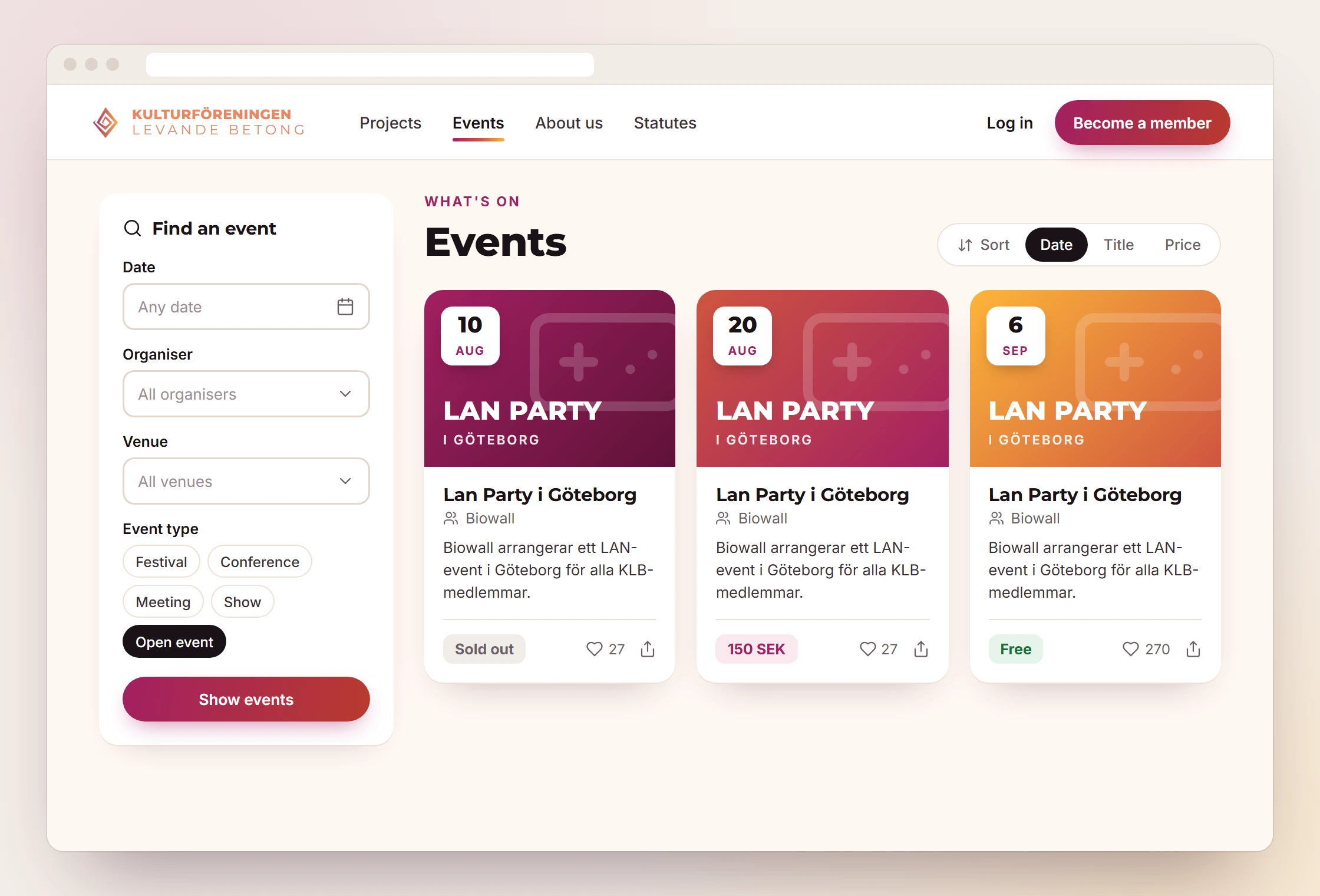
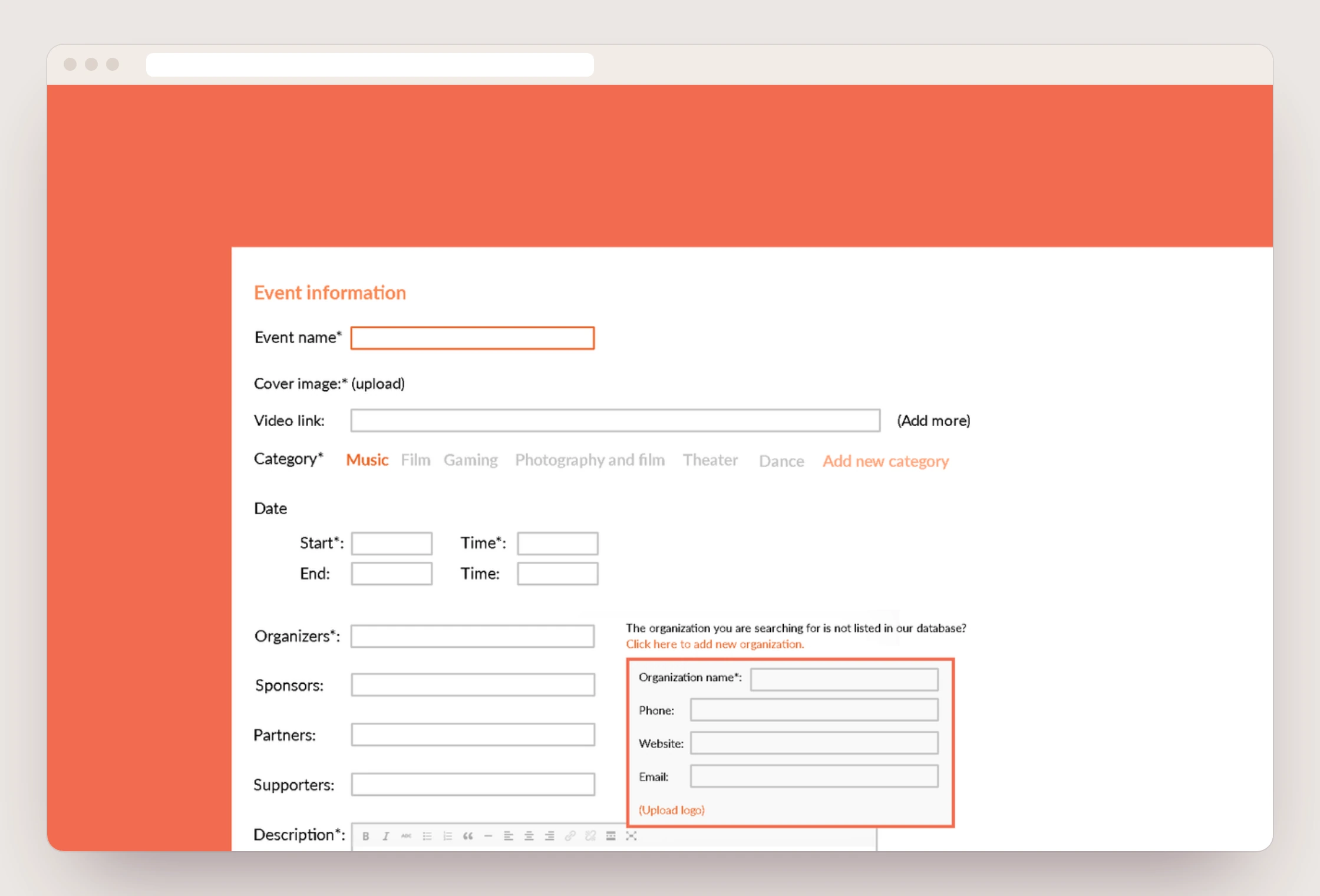
In 2016 we also drew a member portal where members can post their own events and projects, with room for organisers, sponsors, partners and volunteers. We did the design and a clickable prototype. The programming itself was done by an external developer. In the redesign the filters get labels, the price becomes a clear tag and the date sits on the image.
A new event
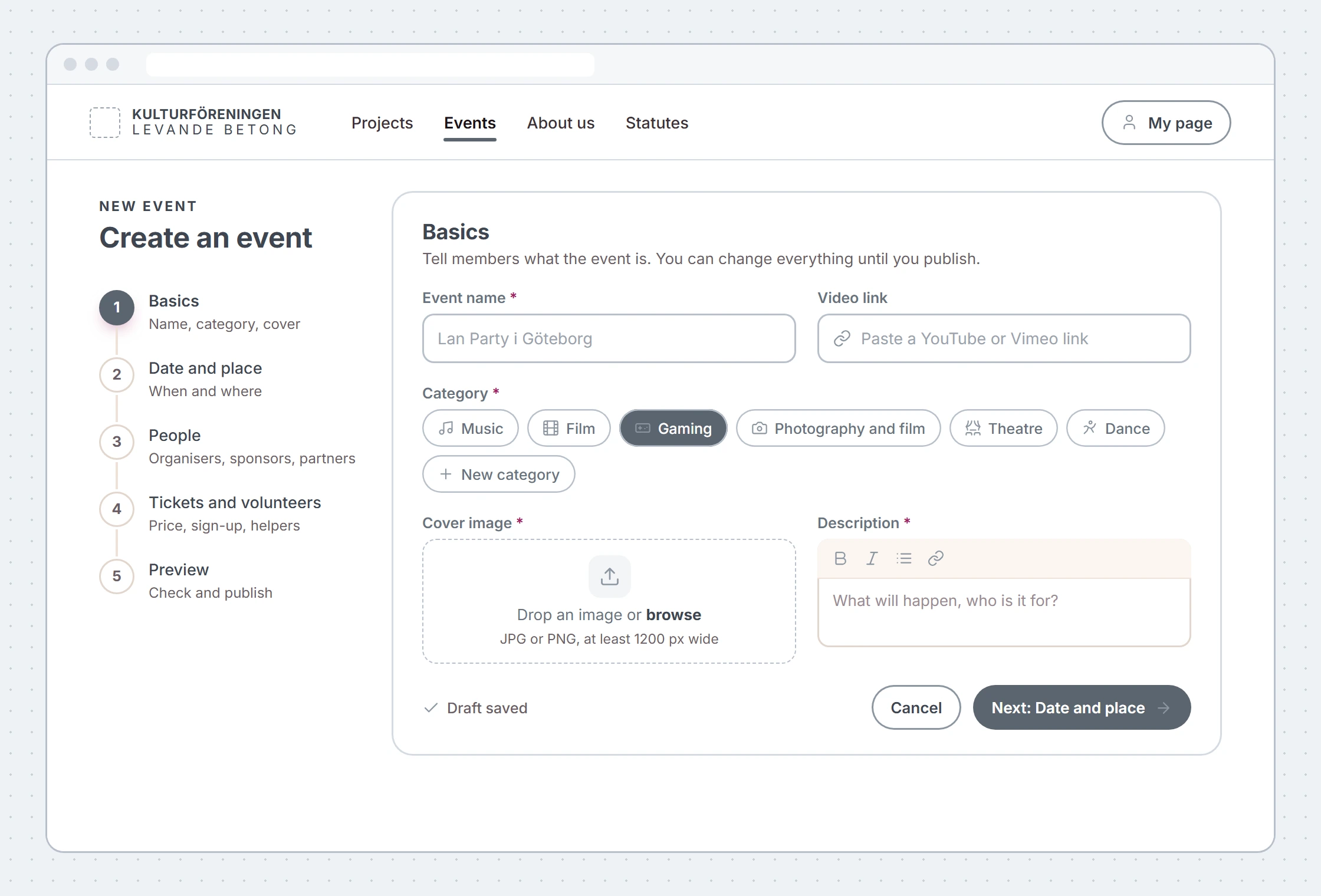
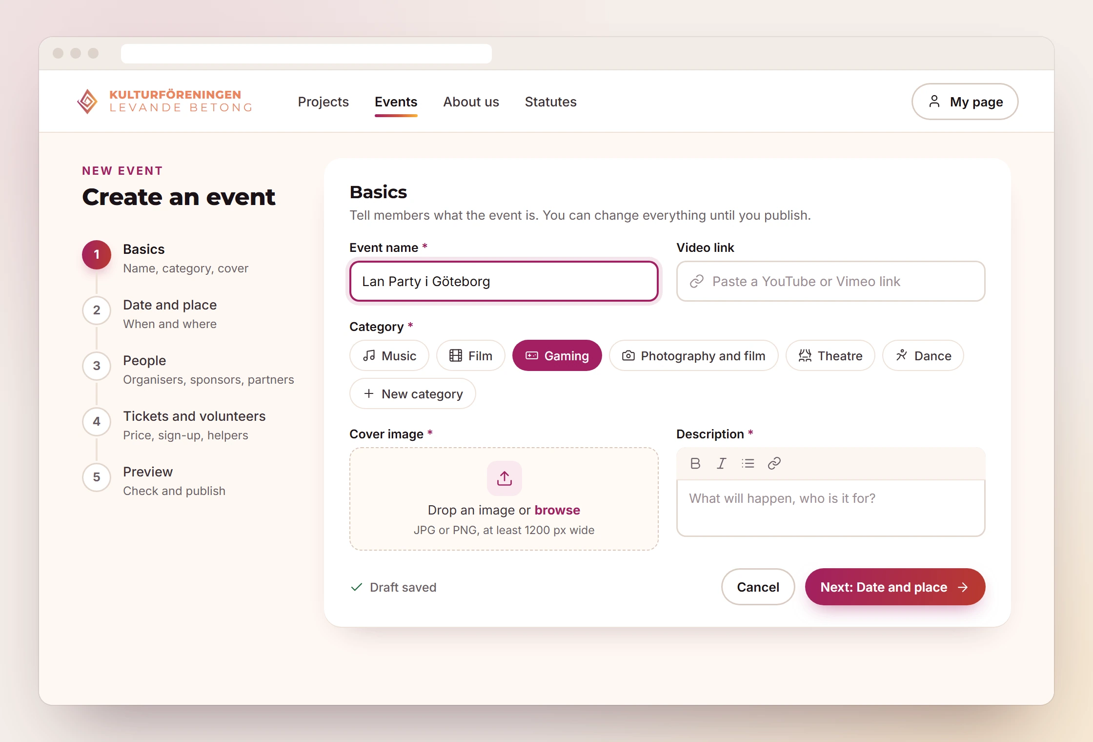
The original form has every field on one long page. The redesign splits the same fields into five steps, saves the draft automatically and shows what is required.
The member portal
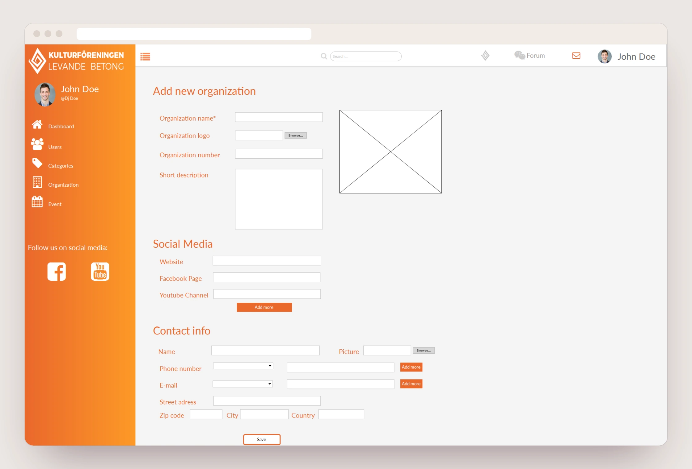
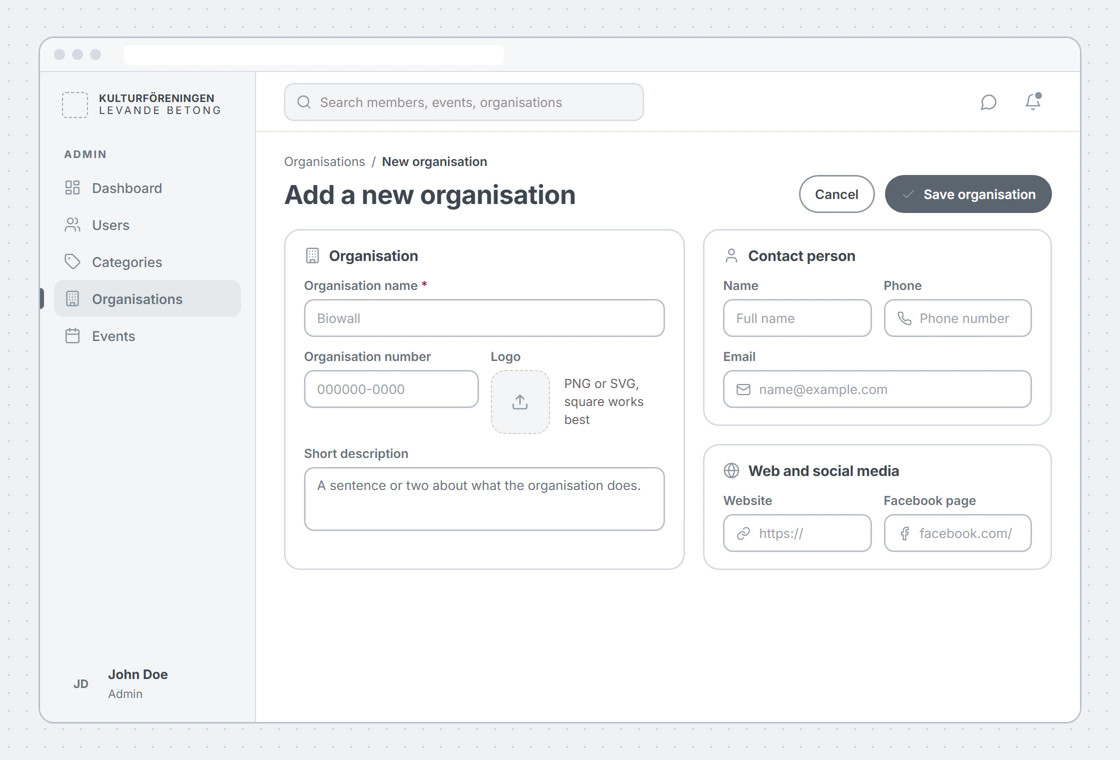
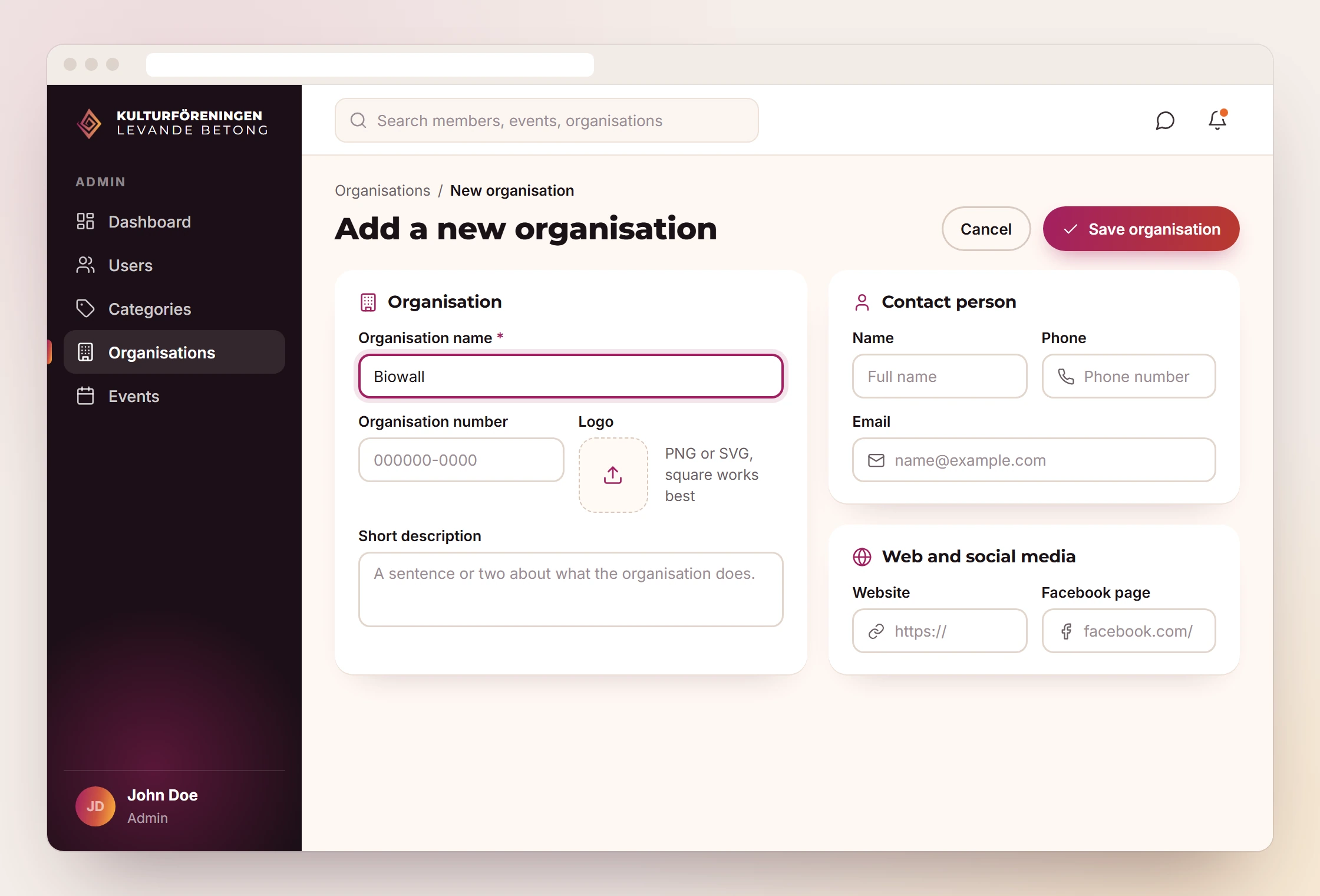
The prototype shows the admin area, here the form for a new organisation. The redesign groups the fields into three cards and puts the save button where it is seen straight away.
The identity in everyday use
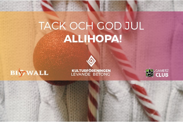
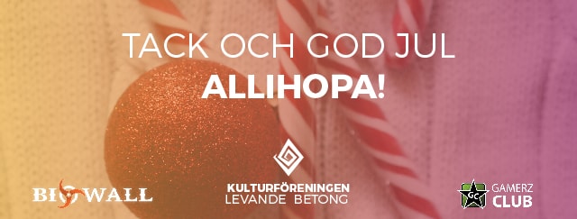
For Christmas 2016 we made a card in several formats with the greeting "Tack och god jul allihopa!" ("Thank you and merry Christmas, everyone!"). The gradient from the logo lies over the photo. Biowall and Gamerz Club, which were also among the projects on the website, appear on the card.
How we worked
- An identity, not just a logo: the same diamond, gradient and typeface in the logo files, on the website and on the Christmas card.
- Sketch before code: the key pages were drawn first, from the home page to the new-event form. The prototype made the member portal clickable before it was programmed.
- Files for every use: the logo was delivered for print and web, as a vector file and in favicon size, in colour, black and white.
What we delivered
- A new logo in 2016 in colour, black and white: icon, horizontal, vertical and a "Welcome to" version
- Logo files for print and web, SVG and favicon icons
- Colour palette and typefaces for the logo and the web
- Design sketches for the website: home page, events, projects, member registration and the new-event form
- A clickable prototype of the member portal in Justinmind
- Business cards
- A 2016 Christmas card in four versions, as a card and as a banner
Typefaces
- Montserrat (logo)
- Lato (web design)
More projects
Got a similar project?
Tell us what you want to achieve and we'll come back with how we'd approach it.
Book a free consultation